 “Oh, no! That’s what our newsletter looks like to a third of the people on our mailing list?!?”Don’t be her. Preview your e-newsletter in different email programs. |
Those new to the world of e-newsletter publishing are often surprised to learn that their email newsletters can look quite different to someone who is using Outlook versus someone using Gmail or Thunderbird, not to mention what it looks like on a smartphone. That’s because email programs (called email clients) process HTML in different ways.
The only way to be sure that your email newsletter template is working well in all the major clients is to actually view it in all of the different programs.
While some email newsletter service providers make this easier than others, it’s not a standard service. But two companies do offer testing programs that will deliver screen shots of your newsletter in various email programs at reasonable prices, even if you don’t use them to send out your newsletter: Mail Chimp’s Inbox Inspector, powered by ReturnPath, (sign up for a free account, then buy three tests for $29) and Campaign Monitor’s Design and Spam Test (sign up for a free account, then pay $5 per test).
It’s well worth paying for the test services every now and then, especially when you make changes to your layout.
If you simply can’t pay, you can do it yourself, but the hassle factor is high. Start by getting free accounts at services like Gmail and Yahoo and installing multiple email programs on your computer (e.g. Outlook, Thunderbird). Beg friends with various ISPs (e.g. AOL, Roadrunner, Comcast) to do screen captures for you. Then run your own tests.
The goal isn’t necessarily to make your newsletter look exactly the same in every program. It’s to make sure that your newsletter is readable in every program and that there aren’t any wacky design shifts that are so distracting that the reader instantly hits delete.
I tweaked my Nonprofit Marketing Tips newsletter this week (go here to sign up, in the left sidebar, under the blue bar) and ran it through both services this morning. Here’s what I found.
MailChimp’s Inbox Inspector
To Run the Test: Set up a free account. Go to Create a Campaign > Inbox Inspector Test. You’ll copy and paste your HTML, and add some other campaign details. Then you’ll pay $29 for 3 tests (nonprofits may get a better deal – I don’t know.). Within one minute, the results started to come in, but they changed after a few minutes, so I’d give it at least 15 minutes before even looking at it.
Campaign Monitor’s Design and Spam Test
To Run the Test: Set up a free account. This email service specializes in serving designers who manage e-newsletters for multiple clients. Just pretend you are your own client. Click on the client name, then create a new campaign (you have to have the campaign ready to go before clicking on the “Run a Design and Spam Test” button). Instead of cutting and pasting your HTML, you have to upload the HTML file. When I got to the section about the mailing list, I stopped and clicked on Design and Spam Testing, and it asked for a $5 payment. Speed was about the same – some results quickly, but not worth looking at until about 15 minutes later.
If you are using another email newsletter provider rather than creating your own HTML, simply login to your account, open a newsletter, go the HTML tab and copy the code. Paste it into a plain text program like Notepad. Then you can copy/paste into these services.
The Results and Pros/Cons of Each System
Plain Text Versions: Both systems convert your HTML to plain text versions for you, although Campaign Monitor’s looked much cleaner than MailChimp’s. Campaign Monitor also showed me the recommended line length on the plain text message, which is nice, so you can add hard-returns if you want.
Spam Filter: My newsletter passed all of the Spam Filter tests in both systems, although there were some non-lethal warnings. For example, apparently the McAfee Security Center spam filter considers these words somewhat spammish: source, way, focus, print, pass, accounts, really, others. It would be crazy to worry about such common words, so I’m not going to. Campaign Monitor said McAfee identified 25 words like this as warnings, where MailChimp said McAfee found 30 words. I guess they must be using different versions of McAfee in their testing.
MailChimp tested against eight different spam filters. Campaign Monitor tested against the same ones, plus the Norton 2008 spam filter, but after several hours, the Norton results aren’t available, so that’s a wash.
Content Assessment
MailChimp analyzes your HTML for you and suggests code fixes. I ran the “clean up HMTL” tool in Dreamweaver before running the tests, but MailChimp still found a few code errors. Fortunately nothing serious — just leaving the # sign off of some of the color codes. My heart did skip a beat when it said it found 47 content errors, however. Turns out they were all spelling errors, which weren’t really mistakes (it didn’t like my name, the way I hyphenated All-Acess Pass, etc.). Campaign Monitor doesn’t offer this service.
Email Client Screen Shots
This is what I really cared about.
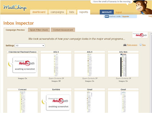
MailChimp’s Inbox Inspector
Campaign Monitor’s Design and Spam Test
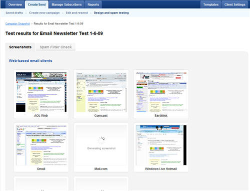
After about an hour, only half of the screen shots were back in both services, but by that point, they both produced some of the biggies, like Outlook, Gmail, Comcast, and AOL. I had simplified my design quite a bit, although I still use a table with two columns, so I wanted to make sure the text wasn’t flowing or overlapping in any strange ways. Fortunately, everything looked reasonably good across the various platforms, although neither one was able to come up with a screen shot from Yahoo! Mail today.
The screenshots did remind me to set all image borders to zero so a blue box doesn’t appear around them when a link is attached. The blue blox showed up in AOL and Comcast, but not Gmail and Earthlink. I’d rather not have it anywhere, so it’s worth adding the border setting in.
Overall, I like Campaign Monitor’s screen shots better. They let you toggle images on and off when those email clients offer that option to readers, so you get a clear picture of exactly what people are seeing. MailChimp lets you see the same thing, but in a less convenient way – you have to open the preview of images on and the preview of images off. Campaign Monitor also groups the screen shots by web-based email clients, desktop email clients, and mobile clients, which I found much easier to scan, where MailChimp groups them all together. MailChimp does show several clients used in Europe, if that matters to you, that Campaign Monitor doesn’t.
What’s Missing
It would be really nice if these services included screen shots of what your email looks like in different web-based email programs in different web browsers. That’s where you can see some real differences.
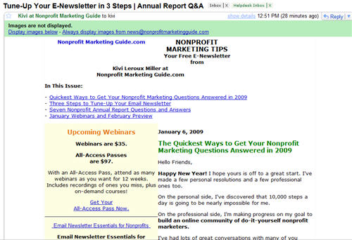
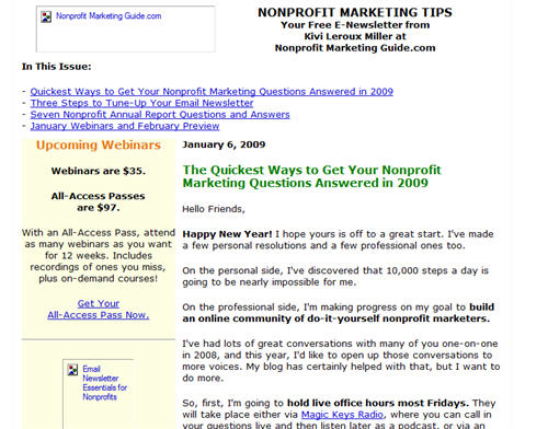
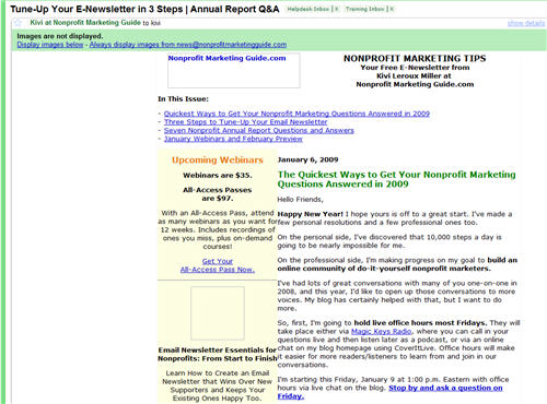
Look at the these three screen captures of my newsletter in my Gmail inbox viewed in Firefox, Internet Explorer, and Chrome. Though I prefer Firefox as a user, my newsletter looks the worst in this browser. The text at the top is wrapping oddly so that my name and organization are below the logo instead of beside it like in the others. Firefox and Chrome both remove padding within the table, so the columns butt up against each other, where Explorer keeps the nice white space. Chrome doesn’t include the ALT text on the images in the sidebar, so those are just blank boxes, while the others give you some of the text.
None of these differences are earth-shattering for this particular newsletter, but they could make a real difference depending on your layout and how important your pictures are.
In Mozilla Firefox 3.0.5
In Windows Internet Explorer 7
In Google Chrome 1.0.154.36
My Bottom-Line Recommendation
I prefer Campaign Monitor’s service, and it’s the more affordable option too (always a nice result!). If you really want that extra code check or send lots of email to Europe, then I’d take another look at MailChimp. In addition, be sure to preview the HTML file in different web browsers to make sure there aren’t any differences you can’t tolerate. If you pasted your code into Notepad, just open the browser and go to File, then Open to view your HTML – it doesn’t need to be online to be previewed

