Photo Credit: https://flic.kr/p/kqkME
Recently, a nonprofit communicator asked me, what are the top three things small nonprofits should do between now and the end of the year to boost online fundraising?
If you are a Nonprofit Marketing Guide pass holder, be sure to check out the recording and slides for “The Beginner’s Guide to Planning a Successful Year-End Online Fundraising Campaign.”
It’s the triage question. Last year’s results were lackluster. You know you need to do something different, but have neither time, expertise nor resources to carry out a full campaign.
Surely there are some small things you CAN do to improve results right now?
Here’s my answer.
Punch Me in the Gut. Use Your Best Stories to Spur Giving.

Photo Credit: https://flic.kr/p/a5fbyn
People don’t give because you need money. They give because they want to help make the world better, to show pride and solidarity, to express their values.
Tell me stories that give me the feels. That show how I, the donor, will make a difference with my gift….right now.
Share outcomes and successes, not outputs. No one cares that you made 100 phone calls. They care that you protected hungry families by stopping cuts to food programs.
Tell me the story of that family that has food on its table and will not go hungry because I, the donor, made a gift. Or the sense of joy and wonderment and opportunity that I, the donor, gave to a child because I gave the gift of music.
Make me care. Make me feel. Make me want to give.
Send More Email.
You aren’t going to raise more money by sending less email.
I recommend sending 6 emails in an online giving campaign, in a schedule that looks something like this:
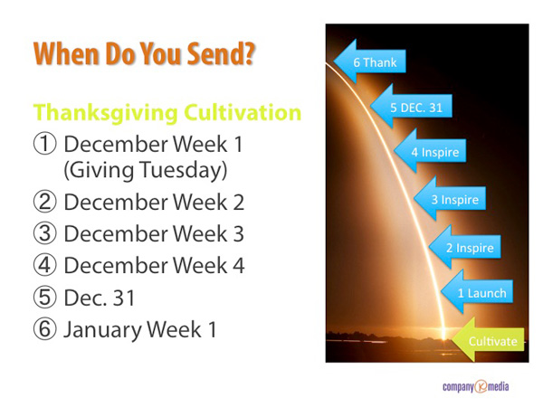
If that freaks you out, dial it back to 2-3 emails. Just promise you won’t send just 1 email out. Also, promise me you’ll send an email on Dec. 31. If you don’t, you are leaving donations on the table — for most nonprofits it’s the biggest online giving day of the year.
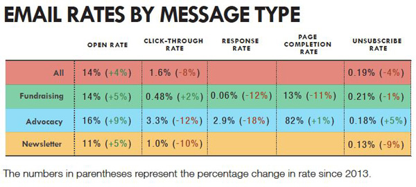
How will you know if you are pushing too many emails? Watch your unsubscribe rate. Here are some 2015 benchmarks from M+R Consulting to consider:
Fix Your Donation Landing Page
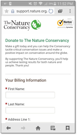
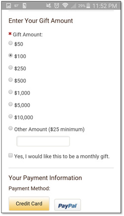
I know you may not have complete control over your donation landing page. But you should have some, and here’s what you are aiming for, if not now, eventually:
- No escape hatches. No other navigation (read our blog, follow us on Twitter, etc.). If someone clicks donate, give them the option to donate, or not (by clicking home), but nothing else.
- Make it mobile friendly ASAP (ask you web design or donation processor, whoever handles the page, for help)
Include a few sentences on why to make a year-end gift - Stress the Dec. 31 deadline
- Include a goal, if you are using one
- Use as few fields as you need to get the gift (you don’t need salutation, middle initial, birthday, subscription preferences…every extra field adds a hurdle for the donor to jump over)
- Pre-select the gift amount you prefer
- Offer a monthly giving option
- If you’ve got them, include charity badges to show ensure you are a trustworthy cause
READ NOW: 12 Nonprofit Donation Pages That Don’t Suck.
I shared my 3 tips. What are yours? Share your top year-end tips in the comments section.

