If you want people to sign up for your email newsletter, you have to give them a reason to do it. What’s the value? What’s in it for them?
Here are three e-news sign-up boxes on website home pages that I recently came across and why I like each approach . . .
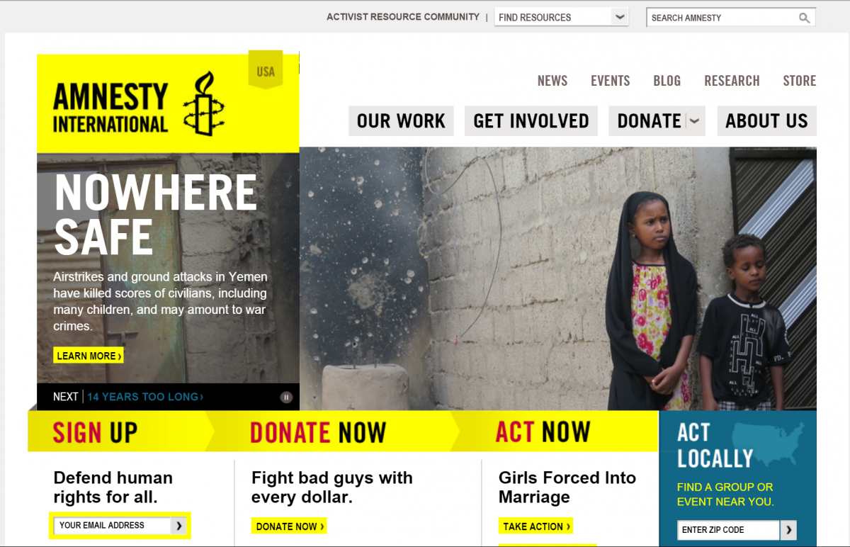
Amnesty International USA
 It doesn’t just say Sign Up. It says Sign Up & Defend Human Rights for All. It directly ties the act of getting on the mailing list to the larger mission of the organization. How could you word a sign-up like that your home page so that signing up is also an expression of your mission or values?
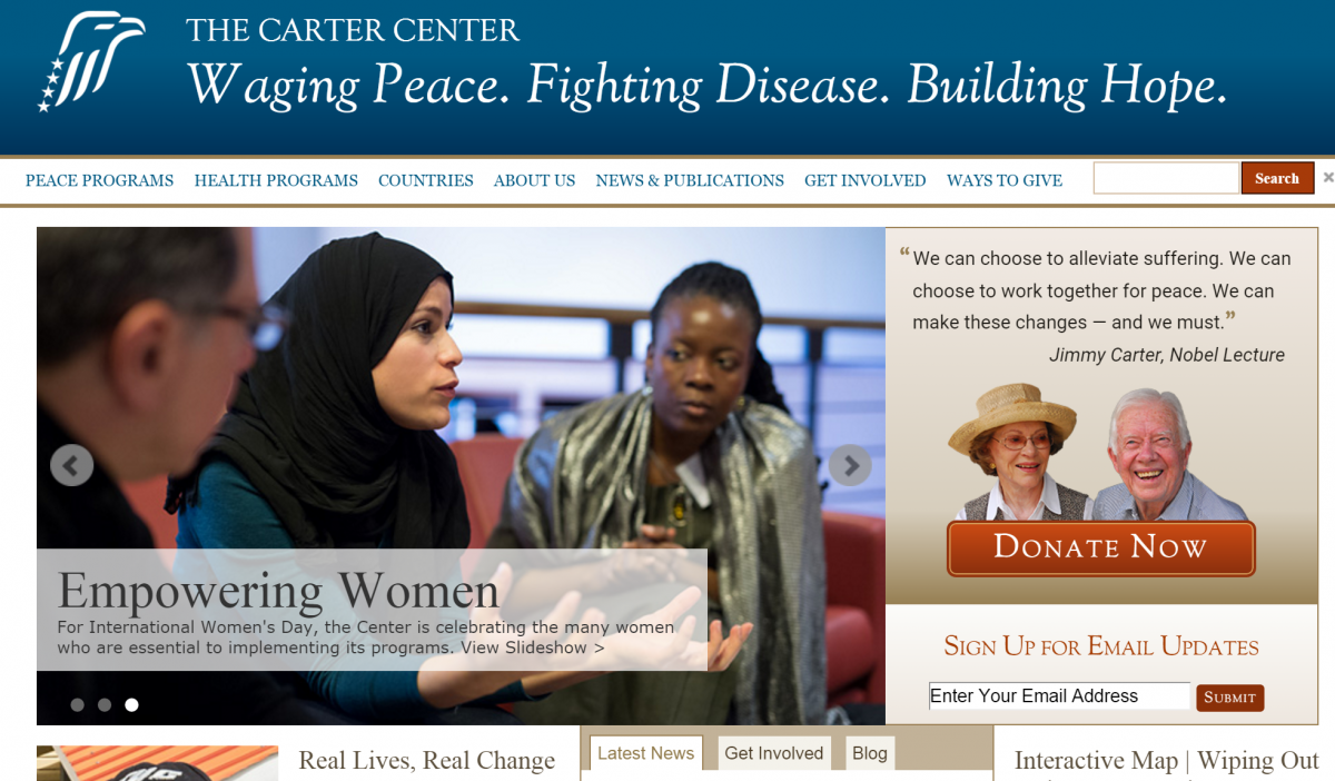
The Carter Center
 What I like about this one is that both the Donate button AND the email newsletter sign up box are right under photos of President and Mrs. Carter. It’s like they are asking us to donate, and we are signing up to get email from them. Who do your supporters want to hear from most? Put them above the sign-up. Celebrity power is nice, but not essential.
Planned Parenthood Action
I like this approach because it is explicit about the content of the email that will be sent. It doesn’t talk about a generic newsletter. It gives me several different kinds of content to expect in the inbox.
Seen others you like? Share links in the comments!


