During Tuesday’s webinar, we’ll be sharing a ton of great nonprofit examples from our Inspiration Files.
Here’s a little preview of some of the website lightboxes or pop-ups we’ve seen and loved recently.
These are specifically for building your email list. We’ll share some used to generate donations on the webinar and on the blog later in the month.
Oxfam America – We Can Do This
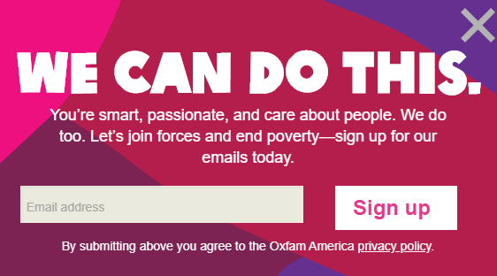
For starters, I love the bright colors. But the best thing about this is the positivity and the supporter-centricity, and how that’s used to invite people to join with Oxfam to end poverty.
Feeding America – Free and Fun Guide
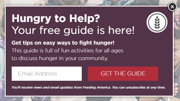
Oh, how we adore some good content marketing at Nonprofit Marketing Guide!
It’s free and full of fun activities for all ages? Yes, please.
SPCA International – Stop the Suffering
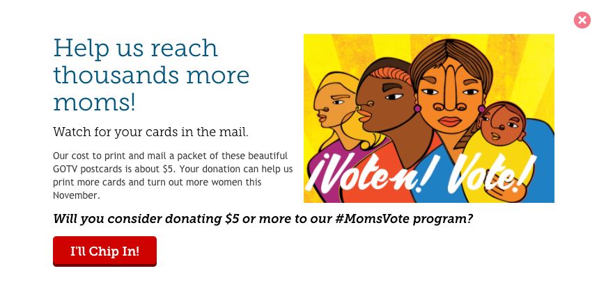
This is a more traditional mission-driven approach with a strong call to action. If you have a super clear message like this one, go for it!
You may be thinking, “But do these really work? I hate them!”
That’s what everyone says, and yet the conversion rates for most of these are much, much better than your standard opt-in on a webpage.
Want more data and advice? Check out 6 Reasons Why Popups, Welcome Gates and Slide-Ins Suck and 15 Email Popup Best Practices To Skyrocket Your List both from OptinMonster.
