
Abby Jarvis
Abby Jarvis is back with more tips on avoiding donation form mistakes. ~Kristina
Guest Post by Abby Jarvis of Qgiv
Last week, I covered four common mistakes I see on donation forms.
- Making a good first impression.
- Keeping donor data safe.
- Not requiring too much info.
- Keeping donors on a single page.
Today, we’ll look at 3 more:
- Including recurring donations.
- Not forcing donors to make an account.
- Maintaining consistent branding.
Mistake #5: Forgetting Recurring Donations
Some of your donors will give once and never donate again.
But nonprofits are trying to change that! According to the most recent Nonprofit Communications Trends Report, over half (53%) of nonprofits now say that donor retention is a top goal for their organization.
Since so many nonprofits now see the importance of donor retention, it makes sense to include monthly or recurring donation options on your online donation form.
Why?
Well, donating to your nonprofit is just a small part of donors’ lives. They have to pay their bills, pick up their kids from school, get haircuts, and go grocery shopping, among other things.
Giving to your nonprofit might not be at the very top of their priority list.
To help take donating every month off of your supporters’ plates, offer recurring giving!
Maybe an example would be helpful in this instance:
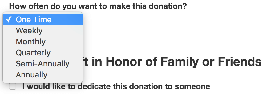
For this particular form, donors have the option to give:
- Once
- Weekly
- Monthly
- Quarterly
- Semi-Annually
- Annually
Bottom line: Having a monthly or recurring giving option on your donation page will help donors give regularly and on a schedule that fits their circumstances.
Mistake #6: Making Donors Create an Account
Your nonprofit likely knows the benefits of having donors create an account:
- Your donors can keep track of their previous donations and update their personal info.
- It makes it easier for your nonprofit to track those contributions.
And while you can suggest that donors make an account, it should never be a requirement on your donation form.
Donors are far less likely to complete the donation process if you force them to create an account.
Instead, try doing what this example nonprofit does:
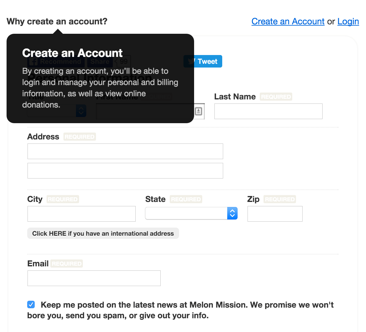
This donation page is accessible to donors whether or not they’ve made an account. It also includes a pop-up window that explains the benefits of creating an account.
Bottom line: Don’t force donors to create an account on your donation page. Encourage them to do so, but it shouldn’t be a requirement for donation completion.
Mistake #7: Inconsistent Branding
Your donors don’t just land on your donation page by typing in the URL. They arrive there through a variety of avenues:
- They look through your website.
- They receive your emails.
- They click a link you posted on social media.
Does your donation page look like those three communication methods?
If not, you might need to take a look at making your branding more consistent.
Why?
Donors want to have a streamlined experience from start to finish. Even if this desire is subconscious, your nonprofit should still remember that consistent branding makes for a more confident donation experience.
Imagine if your donor arrives on your donation page after looking through various sections of your website first.
Your website has consistent colors, fonts, images, and logos throughout, but when a donor arrives on your donation page, it looks nothing like the rest of your site.
If your donation page looks totally different than your website, what are the chances that that donor is going to complete the donation process?
(Hint: they aren’t great.)
But, if your donation page looks like the rest of your website and your other communications, donors will feel more confident in giving to your organization online.
Bottom line: Keep your donation form consistent with the existing branding that your nonprofit has crafted for itself on your website and in your communications.
There are other mistakes that nonprofits can make when it comes to online donation forms. But with the seven remedies as a starting point, you can start to craft a donation page that appeals to your online donors.
Abby Jarvis is a blogger, marketer, and communications coordinator for Qgiv, an online fundraising service provider. When she’s not working at Qgiv, Abby can usually be found working on freelance writing projects or binge-watching sci-fi shows on Netflix.


