Does it ever seem like as a nonprofit communicator you have to do it all? Even if it’s not exactly your area of expertise?
Graphic design is a perfect example of something that should be done by a professional, but most likely falls on your shoulders. Luckily there are a lot of programs, software, and websites that cater to us non-designers.
I have compiled a few of the tops tips I have found and use:
1. Keep It Simple
Make sure every element in the design has a reason to be there. Use the minimum amount of text and easy-to-read fonts.
2. Create a Color Palette
Choose a color scheme that has 1-3 primary colors and an additional 1-3 secondary colors. But that doesn’t mean you have to use 6 colors in a single design. Remember, tip #1: Keep It Simple. Many design services like Canva make choosing the right color schemes easy. Adobe’s color wheel is also helpful.
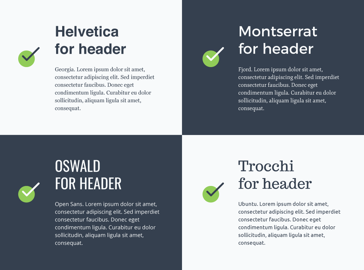
3. Pick Fonts that Work Together
Use pairings that are known to go together as opposed to trying to figure it out on your own. Visme who created the graphic below also put together 15 Font Combinations to Help You Level Up Your Designs.
4. Embrace White Space
Don’t overcrowd your elements. Ample white space makes a design easier to read and focuses attention where it’s needed.
5. Use the Grid Lines for Accurate Alignment
Don’t just eyeball it when you’re aligning your elements. Your design program most likely has lines that will help keep your images and text boxes in alignment. Use them.
6. Learn About Visual Hierarchy
Some elements of your design will be more important than others. The most dominate feature of your design should be the most important. That’s what visual hierarchy is all about. You can do this with size or color. I saw the image below scrolling through Facebook on my phone and it was pretty scary how accurate it was.
Learn more about visual hierarchy from the Interaction Design Foundation.

7. Have a Brand and Style Guide
While we recommend using templates from programs like Canva, stick to your brand’s style. Sure that template with the cursive fonts and black and white photo is trendy now, but will people know it’s from your organization? If you aren’t quite sure what your style guide should look like, Kim Ellsworth of the Idaho Nonprofit Center shows you in this tour of her brand and style guide.
For more on designing as a non-designer, see:
7 Graphic Design Tips for Non-Designers


