This week I have chronicled the story of how Cal’s fundraisers took a new approach to turning alumni into annual donors by creating a graphic-driven, audience-directed, full-color brochure. While the results of the direct mail campaign aren’t in yet, I believe you can still pull several lessons from their experience.
1) Connect with your audience’s memories and emotions. A large group of alumni has never responded positively to Cal’s annual appeals. Instead of continuing to send them more of the same kind of mail that didn’t work, hoping that the alumni would change their minds, Cal conducted focus groups. They honed in on some themes they heard directly from those alumni, and worked with those concepts, even though they weren’t all necessarily positive (e.g., Cal is big, impersonal place.)
2) Try something new and test it. This is the first time Cal has produced a brochure as bold as this one. But rather than sending it out in the world all alone to see how it performs, they also wrote a traditional business letter using the same theme. This split-testing will tell them much more about the success of the brochure than if they had sent it out alone.
3) Let your ideas evolve. Cal started with a cookie cutter theme based on focus groups. But it simply didn’t work. Rather than abandoning the concept completely or sticking with it simply because the focus groups had used that terminology, the fundraising team let the idea evolve into one that worked. I compare it to kneading bread dough until it is smooth and shiny. I have a folder on my computer labeled still cooking for article ideas that aren’t quite ready for publication. I’ve found that it takes at least three iterations from the original concept before the images and text of an idea really gel. (Enough cooking metaphors; you get the idea.)
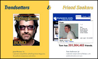
 4) Let the graphics talk. The Cal piece works graphically because it appeals to our natural curiosity, but still provides enough clues that we don’t stray too far away. Take the Trendsetters tagline, with the Rolling Stone cover of Bono. Now, I know Bono didn’t go to Cal, so I’m thinking, “What’s the connection? Let me read this small type down here.” Turns out Jann Wenner, ’67, is the cofounder and publisher of Rolling Stone Magazine and upon closer inspection of the image, I see that he wrote the cover story on Bono. (I personally think that using the Bono cover is also a subliminal message since he is now one of the faces of modern philanthropy, but Cal says that’s not the primary reason why they chose it.)
5) Use “You” Without Being So Obvious. The first drafts were full of “you” statements –“you this, you that” and they were too presumptuous. While I am completely on the “You” bandwagon for nonprofit marketing, especially donor communications, some people are taking it too far. I believe smart donors can see through it, and once everyone employs this technique, the effectiveness of that single word alone will dim. What will not fade, however, is the power of more creative, sophisticated messages that are built off the concept of “You, the donor” without overdoing it.
I hope you enjoyed the series this week. Let me know what you think by leaving a comment on any of the installments.
Special thanks to Amy Cranch and Virginia Gray of Cal for their detailed, honest accounts of the process!


