Julia Reich has been guest blogging for us on graphic design topics. This post shows the creative process a design project can go through, while also helping you understand ways to graphically communicate ideas and data. Be sure to check out her first post on design style guides and second on evaluating your logo too.
Guest Post by Julia Reich, Julia Reich Design
The Challenge
Our client, School Food FOCUS*, recently asked us to re-design this marketing piece. The reason for the re-design? They felt it was not adequately communicating the scope of what they do and who they do it for. Plus it’s just kind of homely. (By the way, I’ve eliminated non-essential text and graphics from the page to avoid visual distraction).
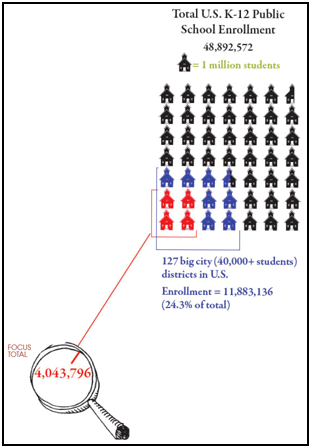
It’s a challenge to visualize data clearly, effectively and attractively. Comprehension is critical (We find the amazing graphic work at GOOD magazine is always an inspiration).
But first, we need to know what this organization does. What’s their mission? School Food FOCUS works with the largest school districts nationwide to advocate for school meals that are more healthful, regionally sourced, and sustainably produced. “FOCUS aims to transform food systems to support students’ academic achievement and lifelong health, while directly benefiting farmers, regional economies, and the environment.”
In studying the old graphic carefully (above), we could see that FOCUS is reaching a lot of kids in the country’s big city districts. But that was only part of the story this organization needed to tell. The new design also needed to visually represent the following core concepts:
- FOCUS works with many of the nation’s public school districts, including the largest ones
- A lot of these districts offer a high percentage of free and reduced lunches to needy kids
- The nation’s largest districts convey the strongest market pull
- This buying power affects how school lunches at public schools are procured
- FOCUS is successfully helping the most students in the nation’s neediest schools eat better
The Creative Process
Round 1
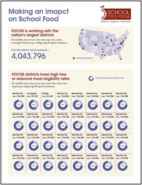
In this initial solution, we dispensed with the clip art schoolhouses and decided to break up the main messages using several graphics:
- USA map showing locations of participating districts
- Highlight the total number of students reached by School Food FOCUS in large point type
- Emphasize the high percentage of free and reduced meal eligibility rates within School Food FOCUS’s partner districts
Plus we took a stab at drafting copy for a main headline and sub-headlines, enabling the reader to put the data visualizations into context.
(Note: for this round and subsequent rounds, data and text does not represent final numbers and copy.)
Round 2
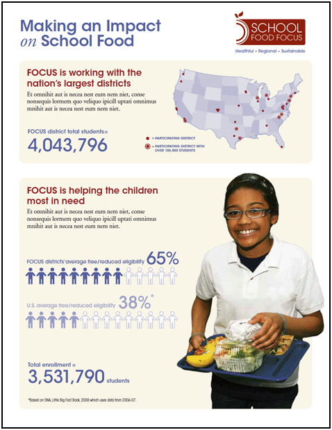
However, the “donut” graphics, 32 in all, proved overwhelming to digest, so we removed those. And there was a big ol’ typo in the title. Also in this round:
- On the map, we highlighted not only all the participating districts with a red dot, but also emphasized which of these were very large, with over 100,000 students, using a red dot within a circle
- Made further changes to the second part to try to convey more effectively that School Food FOCUS helps those children most in need of healthy lunches
- Added a photo
Round 3
In this round, we responded to the following client feedback:
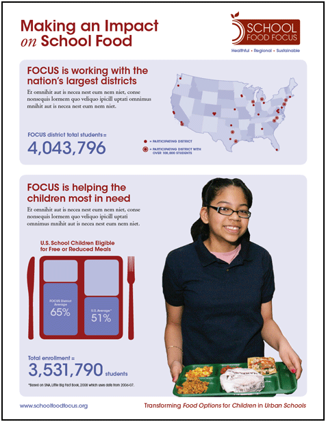
- They liked the addition of a photo, but requested one where the child is not eating a banana, which is not sustainably sourced (oops!)
- In the graphic comparing the Free and Reduced percentages of FOCUS districts vs. the national average, the little people figures weren’t working too well, because they wanted to see something that showed more clearly that the two percentages are being compared to one another. So we developed this version using a lunch tray, where the data is together in one graphic.
This project is a work in progress. As designers, we take pride in our creations that offer visual appeal. But is it functional? How successful have we been so far in communicating our client’s core messages?
Has your organization produced a compelling infographic you’d like to share?
(For more about infographics, with several great examples, see Smashing Magazine’s post on Data Visualization and InfoGraphics).
*”FOCUS”: Transforming Food Options for Children in Urban Schools
