Image source: https://flic.kr/p/8fVJ1b
Fundraising goal established. CHECK.
Compelling stories selected. CHECK.
Email arc created. CHECK.
Donation landing page updated. CHECK.
Sounds like your year-end online fundraising campaign is off to a solid start.
Wanna kick it up a notch?
Try one of these 4 tactics to boost your online fundraising this December.
1) Offer a Match and Promote the Heck Out of It
Donors want more bang for their buck, and they love matches. Who wouldn’t want to be twice as awesome, and do twice the amount of good with one gift?
You may see a lot of online matches…that’s because they work!

Never offered a match? Approach a major donor or foundation that already gives a large gift. Share with them how their gift/funds can go even further, inspiring individual giving and capacity building by recruiting new donors.
Here are a few tips on running match campaigns:
- Show the Math – $25 becomes $50, a $100 donation automatically becomes $200
- Stress Impact – help twice the number of people, do double the good
- Give Updates – tell donors where you are with your match goal — there’s more to a campaign than kick-off and completion, and updates build momentum
- Use Graphics – try a “Double My Donation” button or $2-for-$1 messaging prominently in headlines, subheads and graphics
2) Resend Winning Emails, Rake in More Donations

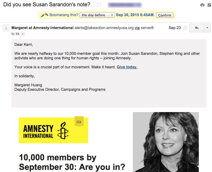
Ever get one of those “Did you see the email that we sent you last week?” emails? It’s called a resend, and here’s how to use them like a pro.
- First, swallow your distaste for them. Used properly, it could be the easiest money you raise in your entire campaign.
- Don’t just resend any email, pick a winner. You know it works. Don’t. Resend. Stinky. Emails.
- Write a super short lift note with a few details, adding a different perspective, “I hope her story moved you as much as it moved me”
- The lift note can be from same person as the original send, but I prefer a different person, again, to give that difference perspective
- Only resend to non responders…supporters who did not open or who did not respond to the first email
With very little extra effort, you could bring in 30-50% of the original haul.
3) Catch Eyeballs With a Notification Bar
![]()
People come to your website for all sorts of reasons. And let’s face it, your home page just may be a hot mess with no real focus. Even if you added a home-page feature about your year-end fundraising campaign, would anyone really be able to find it?
The super simple notification bar helps you capture that traffic. It’s a thin, brightly colored ticker for the top of your website. You can use it to drive traffic to your donation landing page (or collect email addresses or promote your social channels, but I digress).
The key here is to use a color that pops (hot pink anyone?) and use it in limited duration so it does indeed stand out.
Ask your web developer for his/her favorite notifications bar. It’s usually a simple plug in or module.
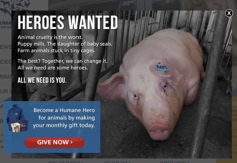
4) REALLY Catch Those Eyeballs with a Home Page Light Box

Love them or hate them, light boxes (also known as home-page takeovers or home-page hijacks) can drive your donation conversions up.
Why? Your website visitor must see your call to action first, before anything else.
Here’s how to do light boxes right:
- Use a simple, bold, compelling image, preferably a close-up. No compilations or groups shots.
- Use an extremely clear and urgent call to action. No “learn more” or “see how you can help” here. Donate now. Give today. Don’t wait. Make your donation today.
- Set your light box settings to only pop up once per day per visitor.
- Like the notification bar, use them just for a campaign – no more than a month.
There are dozens of light box plugins. Ask your web developer for a suggestion.
Have you used one of these tactics or tools? Help your fellow fundraisers and share your experience in the comments section.


