We are used to hearing from people who hate doing their nonprofit’s annual report. But in the 2020 Nonprofit Communications Trends Report survey, we heard from many people who loved doing their annual report because they were given permission to do creative short reports. Amanda is one of those people (and a graduate of our Communications Director Mentoring Program), and she shares her story with you today. ~Kivi
Guest Post by Amanda Steepleton
Okay, I’ll admit it. In the ongoing debate about the nonprofit annual report – love it or hate it – I’m firmly planted on the love side. But it wasn’t always this way.
Today, I’m going to walk you through my journey towards creating an annual report I truly love. And just maybe you can become a convert too (or if you already love yours, cheers to you)!
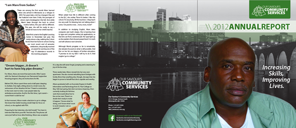
I, of course, inherited an annual report when I first started at my organization. This is what it looked like the year I arrived:

Altogether, it could be worse. It’s a short-form report, not twenty pages of headache-inducing madness. We’d also already ditched the controversial donor list, leaving the option on our website for those who wanted it. And it does convey essentially what was accomplished during the year.
But…this report is DULL! There’s a lot of text packed on these pages and very few visuals. The content is heavily “us” centered with the word, “you/your” appearing a measly five times. Worst of all, there’s no trace of people—the reason Our Saviour’s Community Services exists—anywhere in the design.
I knew I wanted to make next year’s report more visual and colorful—something that would feel personal and represent who we are at a glance. I also wanted to introduce a strong element of storytelling, which features prominently in our communications the rest of the year.
The result was this tri-fold report:
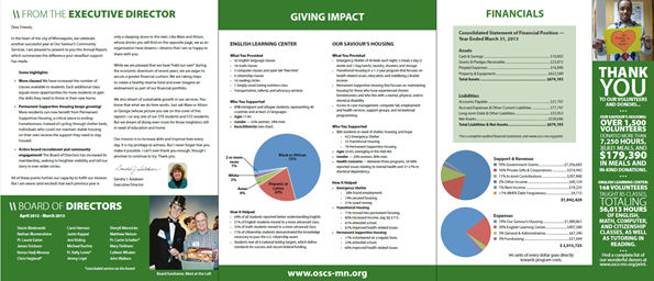
Looking back, I’m still pretty happy with this report. But it’s continued to evolve since then. I added more donor-centric language and introduced infographics to display program impact. Then, a few years back I changed the format entirely. Our annual report became a foldout poster:
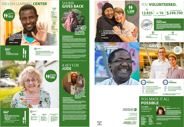
This was a big change, and I spent a lot of time with our designer on content and design. The even shorter form forced me to scale back and ask, “What is really the most important information here? What do I want my reader to take away?” I pared down the program info, as well as the financials. The key thing was to focus on the big numbers and total impact.
Most recently, our annual report took an exciting new direction. For a while now, I’ve wanted to create a web version. The printed poster is great because our donors love receiving it, and we can also hang it prominently around our offices and programs for all to see. But a much wider audience would view the report on our website. Posting a pdf isn’t ideal, especially because the layout of the poster doesn’t make much sense without seeing how it folds down.
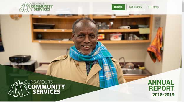
Fortunately (and I know not everyone is in this position), I have fairly unlimited access to our web designer. We already had all the content from the printed version, and she was able to create the web page in almost no time at all! Here’s what it looks like:
I think one of the things that has helped me continue to love our annual report is that it evolves. I’m not just phoning the same thing in year after year but continue to try new things and keep it fresh. In the future, I’d like to try the pocket-sized folding annual report like the one Kivi has shared from the Potter League for Animals.
This piece, perhaps more than any other thing I do, allows me to unleash my creativity. It’s about visual storytelling and creating a feeling of joy. If you view your annual report this way, you might just come to love it too!
Amanda Steepleton is the Communications Manager at Our Saviour’s Community Services in Minneapolis, MN. She spends her days sharing stories and connecting with others who care about increasing skills and improving lives through shelter, housing, and English language education. Nights and weekends, Amanda moonlights as a graduate student in organizational leadership at St. Catherine University. She loves her dog, ice cream, and the Oxford comma.
For more, see Nonprofit Annual Report Best Practices, Example, and Templates.
