Steve Streicher
Earlier this week, we talked about ways to make your website easier to read on mobile devices. Today we talk about making your annual report easier to read by creating an online annual report. Stephen Streicher shares why New York Cares decided to go with an online annual report. ~Kivi
Guest Post by Stephen Streicher of New York Cares
Nonprofit organizations are constantly striving for efficiency. They’re evaluated on how efficiently they spend their funds. They’re always looking for ways to more efficiently spend staff time. And, no matter how beautifully designed or how controlled the costs, when I meet with a potential partner or donor, I never feel very efficient when I hand them a glossy 25-page annual report.
When creating a printed report, there are just too many factors that can lead to increased costs or problematic inaccuracies. If there is a glaring typo, I might have to re-print the entire report. If there is an important development in the organization’s work, but it happens after content is finalized, I might miss an important opportunity or be stuck with a public relations challenge.
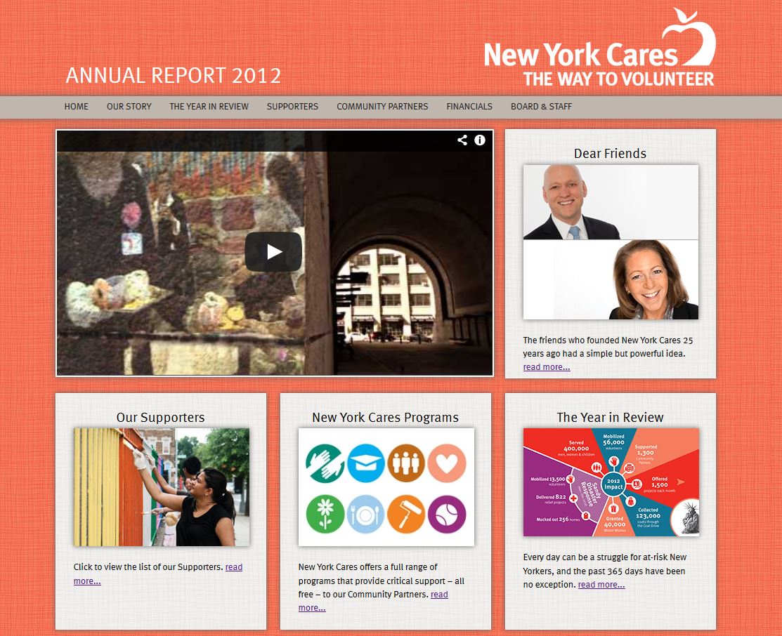
This past year, New York Cares was heavily involved in Hurricane Sandy recovery work, a highly-visible operation that was changing on a daily basis due to the needs of the affected communities. In the midst of these efforts, we were also beginning development of our annual report, and the ever-present obstacles inherent in the development process of these large reports coupled with the uncertain programmatic environment led my communications team to a new format for the 2012 edition: an interactive mini-site.

Three qualities of the online report format helped us move forward:
- Flexibility of design and content – I’ve heard musicians laugh when asked whether they wrote the music or words first when coming up with a new song, and I get the same feeling when asked if text or design comes first when developing an annual report. Syncing the two can definitely be tricky. The mini-site made this task so much easier, eliminating the headache of text changes throwing off layout and allowing for the tweaking of a phrase or a photo right up until the go-live date.
- Faster development process – time is always of the essence for nonprofits, but we were feeling especially squeezed with many resources dedicated to hurricane response. We used a content management system (we went with Drupal, but WordPress was also an option) to create the mini-site, leveraging design templates, easy content editing, and the ability to integrate various content types such as video to produce a more vibrant report in less time.
- Lower costs – a report where you don’t have to use gobs of ink and high-quality paper typically equals a much more affordable one. We simply loaded Drupal, a free, open source platform, onto our web server and started uploading copy. It was as simple as that, with no additional costs beyond staff time and what we already pay to host our website.
So far, the mini-site seems to be a rousing success. Another advantage of an online report is that we can track readers much more accurately than with a print/PDF-only version, and we’ve seen thousands more visits to the site than we’ve had printed copies distributed and PDFs downloaded in the past.
We haven’t done away with the printed report completely as visitors can still request a hard copy if so desired, but with more readers, lower costs, and more accurate and compelling information, the online annual report seems like a no-brainer if you’re looking to increase efficiency.
Steve Streicher is Director of Marketing & Communications at New York Cares, New York City’s largest volunteer management organization. Steve provides communications strategy, content development and management, public relations planning, and online expertise for the organization and consults with other nonprofits in areas such as new media, social networks, mobile, community-building, cause branding, and more.


