Guest Post by Rosie Aquila
“If our website was better…” My first year at Iona Senior Services, I heard this phrase more times than I can count. Usually, it was paired with a long sigh.
And my colleagues weren’t wrong: our website was difficult to navigate, it had impersonal and small photos, and – worst of all – it focused on Iona and not our audience.
Old website:
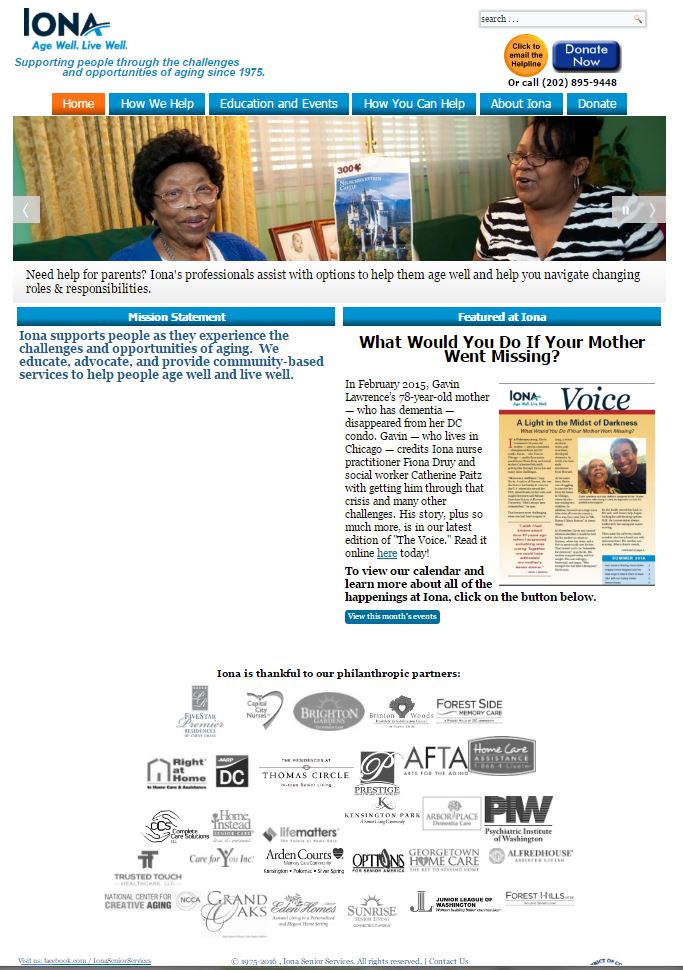
Iona’s old website homepage.
Back then, if you came to our site, you’d probably have a hard time determining how we could help you or why you’d even want our help.
And our metrics reflected that fact.
On our old website, the bounce rate was 52.78%. That means that more than half of the visitors to our site immediately left it.
Let me say that again: more than half of our visitors came to our homepage, didn’t click on anything, and likely closed the tab or navigated elsewhere. YIKES!
Putting the Human Back Into Your Website Communications
When I finally had the opportunity to redesign our website, I started with that metric. How could our new website’s design and content encourage visitors to stay on our site, click around, and ultimately engage with us and take an action?
My answer was simple: put the human back into our communications.
Ok, well, maybe it’s not that simple.
You’ve likely read somewhere the importance of user-centric language or focusing on the audience in your communications. But, how do you actually do that?
Here are some strategies that worked for me.
Ask Your Audience
Before I started writing content, I began with research. I read archived newsletters, interviews, testimonials, and any other collateral materials I could find to learn more about how Iona and others described our work.
I also scheduled informal interviews with staff, donors, volunteers, and clients. In those conversations, I asked open-ended questions about the programs they were involved in, how they would describe Iona to someone new to the area, and what information they thought a visitor to our website should know. It took time, but the results were invaluable.
By talking with Iona’s audience, I learned what matters most to them. I learned why they sought our services (or why they volunteer or donate) in the first place. And I learned what answers or solutions they need from Iona.
All of this feedback helped me organize and prioritize the information on our site. Plus, because I recorded the conversations, I was also able to pull out any repeated words or phrases. The result was that when I finally sat down to draft the pages, I had relatable language directly from my audience (and no jargon)!
Use “You” Language
Our old website was rife with “we” statements. As in, “We provide this service. We do this great thing. We help.” The problem with that kind of language is that anyone visiting our site couldn’t see themselves in our communications.
So, in the update, I focused on the “you.” As in, “You have this challenge. You need help. You’ll gain confidence and support.”
Old website:
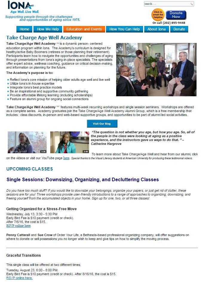
Screenshot of a program page on Iona’s old website. The introductory text reads, “Take Charge/Age Well Academy is a dynamic, person-centered education program within Iona.”
New website:
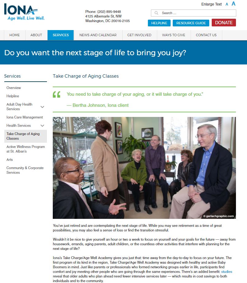
On the new website, the Take Charge/Age Well Academy page begins with “you” language and a testimonial. It reads, “You’ve just retired and are considering the next stage of life. While you may see retirement as a time of great possibilities, you may also feel a sense of loss or find the transition stressful.”
Prioritize What You Want Your Audience to Know (Or Do)
Our old website’s navigation was, in a word, impossible. There was no hierarchy for our many services and it was difficult to know where to click or how to find what you were looking for.
Iona’s new homepage breaks down our three main audiences (active older adults, caregivers, and those planning ahead) and guides them to specific points on the website. And for those who want an overview of our work, they can easily find what we do under “services.”
Old website:
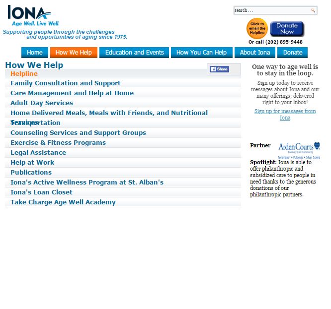
A screenshot of Iona’s old website navigation.
New website:
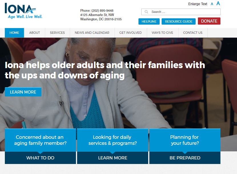
Iona’s new website has three buttons on the homepage directed for three separate audiences.
Stay Active
Our previous site had no way to share updates or new information. With the redesign, that needed to change. How was Iona going to stay relevant, timely, and useful to visitors? Ultimately, I landed on blogging.
By regularly publishing content on our blog, our website stays fresh and incorporates new ways for visitors to engage with us. They might share a post on social media or simply leave a comment. Plus, blog posts are a great way to drive traffic to our site because I can share posts on Iona’s social media channels or in an email blast.
Leave Room for Stories
A compelling story (or photo) can go a long way. Our new site has big, bold photos. Our webpages share testimonials from clients, volunteers, and donors. And, we have a designated spot on our homepage for personal stories with bright and friendly photos.
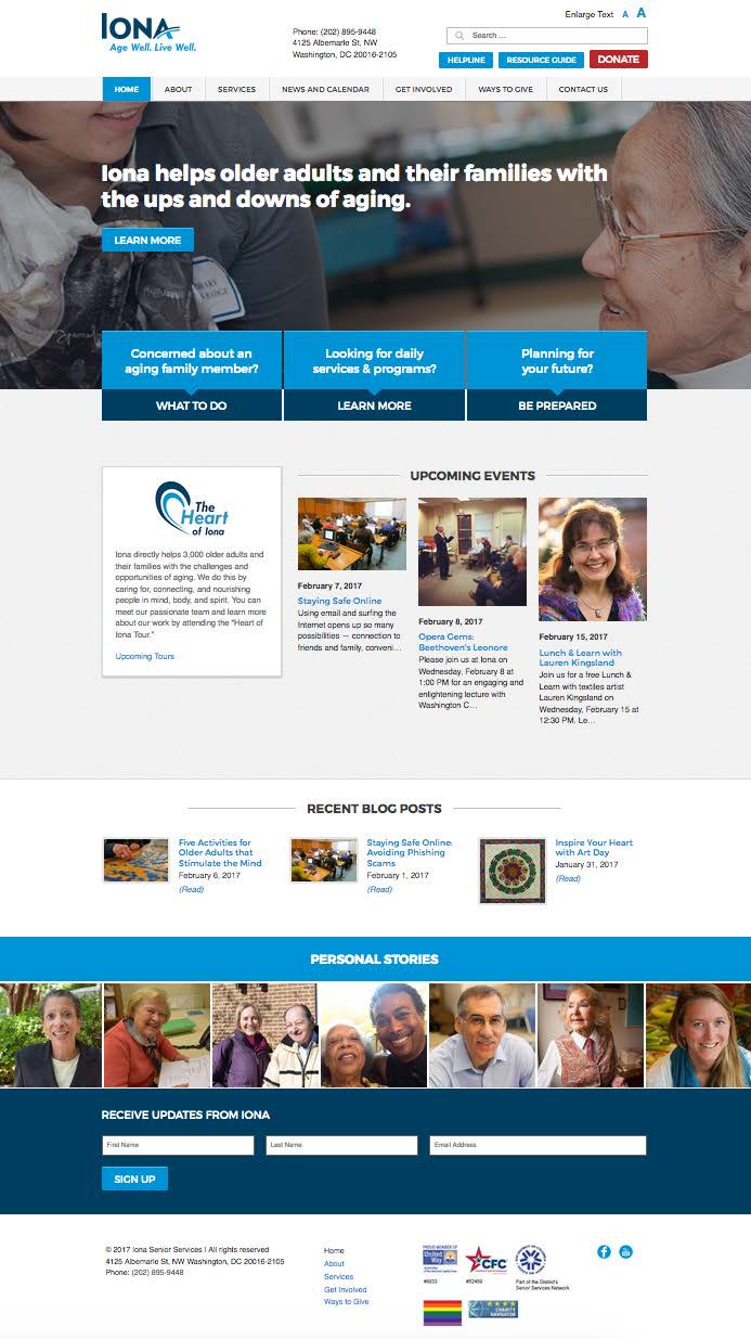
Iona’s new website’s homepage, including a “Personal Stories” section at the bottom.
So, did these changes affect our metrics?
I’m happy to report that since our launch in October 2016, our bounce rate has been around 1%.
How do you put the human in your website communications? Share in the comments!
Rosie Aquila is a participant in Kivi’s mentoring program for communications directors. She is currently the Communications & Marketing Manager at Iona Senior Services in Washington, DC. Like most nonprofit communicators, she wears many hats including creative problem-solver, designer, blogger, editor, fundraiser, content marketer, webmaster, and social media manager (among others).
