But let’s face it . . . it’s actually much better for your sender reputation to have them unsubscribe than it is for them to never open another email or even worse, to hit the spam button.
That’s why you should make unsubscribing from your email list easy.
- Don’t try to hide the unsubscribe link.
- Don’t make them log in with a password to unsubscribe.
- Don’t make them click three places or confirm three times that they want to unsubscribe.
- Don’t make them fill out a survey before unsubscribing.
All of these things will just result in them hitting SPAM instead.
But I don’t recommend doing an automated “one-click” unsubscribe either! If I accidentally click the link, and bam, I am off the list, I think that’s a little too easy.
Instead, find a happy middle ground.
When people click unsubscribe, take them to a form on your website. Pre-populate that form with the address they are managing. This is really important! So many of us are using multiple emails and we want to customize what goes where. I don’t want to have to go back to my inbox and see which email you used (I have about five email addresses coming to my inbox).
Then, offer a few options. Don’t overwhelm people with all kinds of choices they have to read through (remember, they are trying to unsubscribe because they don’t want to read your stuff!).
Think about frequency options first. Can you offer to email less?
Or what about topics? Can you offer to email certain types of content?
Again, try to keep these as short and sweet as possible.
I looked at about 20 different unsubscribe pages for nonprofits this morning, and wow, it was discouraging. They were mostly awful, and I’m talking large well-funded nonprofits that should really be doing a much better job.
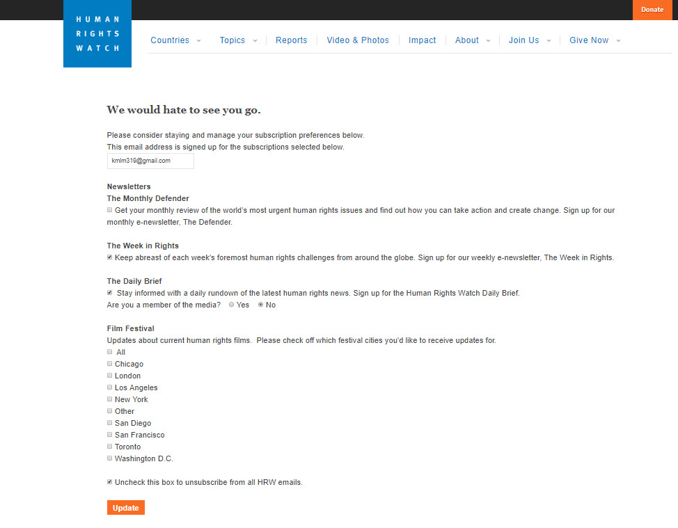
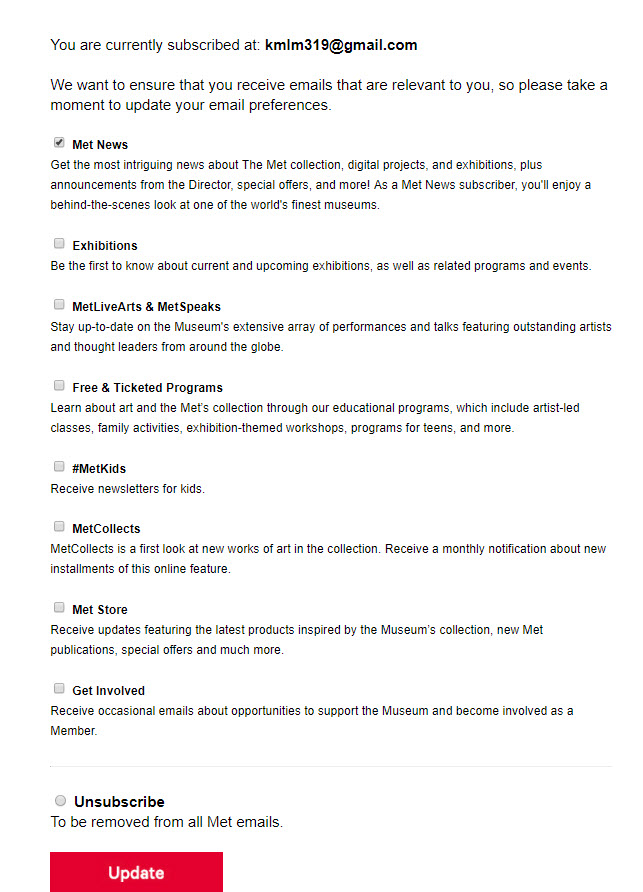
Of all the ones I looked at today, the two that I think are closest to today’s best practices are from Human Rights Watch and the Met.

I like the Human Rights Watch unsubscribe page because it offers frequency options right at the top, and we know frequency is an important consideration for people. They include the frequency right there in the name of each newsletter, so you can easily pick monthly, weekly, or daily.
I also love how they offer a geographic option for their film festival.
I am not so crazy about what feels like double-negative wording to me: “uncheck to unsubscribe.” I saw this approach on several pages and really don’t like it. It’s too confusing and could almost be considered misleading.
Instead, I prefer the overall approach of The Met. They provide options, and the very clear choice at the bottom to unsubscribe from all emails by checking the box.
I would suggest that they streamline their choices a bit and clarify the differences as there seems to be a lot of overlap in the choices.

Look, I know this isn’t always the easiest place to implement best practices (again, I saw some real disasters in my research today).
Much of this depends on the capacity of your email providers and CRMs. I speak from experience about how frustrating it is when your service providers make it difficult or nearly impossible to follow best practices. Our own unsubscribe pages aren’t perfect either!
But you should still give it a try and do the best with what you have. Then add all the things you can’t do, but think you should, to your wish list for when you go shopping for new software providers.
I’ll share much more about email list management best practices and engagement during our new webinar on September 20: Beyond Opens and Clicks: Maintaining a Healthy Email List and Re-engaging Your Community.


