Lindsay Ackerman
We love “Before and After” posts, so I jumped at the chance to get Lindsay Ackerman to share about Mission India’s recent e-newsletter format change. She graciously agreed to write about the process and the results for us. ~Kristina
Guest Post by Lindsay Ackerman of Mission India
There are times when I come home from work and my husband asks what my day was like, and my only reply is…
“I sent an email.”
If you are involved in the planning, writing, designing, or sending (more likely, all of the above) for your nonprofit’s mass emails, you know what I’m talking about.
You spend hours crafting the perfect opening line (and if you’re doing it right, even longer on the subject line).
You live preview your mail merge data to make sure no one’s email says “Dear Grumpy Cat.”
You send test emails to your colleagues.
You double check your Alt text on your images.
You make sure your list has all the right people.
You send one more test email to yourself.
And then, nervously biting your nails, you hit “send.” And you wait…
After investing all that time and energy, it sure is frustrating when you don’t see the open rates you hope for! Or worse, your click rates start trending downward.
When Kivi sent out a link in April to sign up for an e-newsletter Feedback and Fine Tuning webinar, I was quick to register. (If you’ve never done one of these sessions before, they are fantastic – just make sure you check your ego at the door!)
And we got the honest feedback we needed: the two-column format we thought looked so great was actually too distracting and visually overwhelming.
The same day I went back to the drawing board, recreating the e-newsletter from scratch — with a one-column template.
We use MailChimp as our email service provider, and they offer easy to use drag-and-drop templates to get you started, so it didn’t take me long to go from this to this.
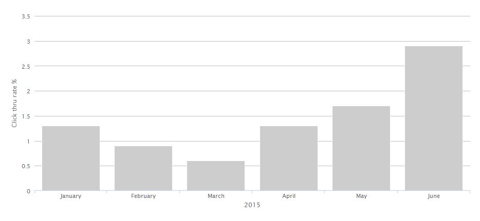
Since we rarely get feedback from our supporters, the only way I could evaluate response to the new design was to watch the data:

May and June were the first months with the one-column format (we had a match offer in April that might have caused the uptick). March hit an all-time low click-through rate of 0.6% — you can see why I was panicking a little!
We’ll continue to watch the data and see where we can make more improvements, but I was thrilled to see an immediate impact with one simple change. (And honestly, a one-column layout is easier to design, too!)
What about you? What do you think of our before and after? Are you already using a one-column e-newsletter design? Comment below to share what works (or doesn’t work) for your non-profit.
Lindsay Ackerman has been with the Mission India team since 2006 and serves as the marketing communication specialist, short-hand for “does a little bit of everything,” from editing to data analysis to project management.


