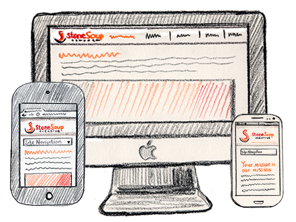
 S, M, L, XL: Why Responsive Website Design is the Best Strategy for Different Size Screens Gallery
S, M, L, XL: Why Responsive Website Design is the Best Strategy for Different Size Screens
Communications Team Management, Relationships, and Boundaries, Fundraising, Video, Graphics, Photography and Other Visuals, Websites and Blogs
What We Blog About
- Your Nonprofit Marketing Career Path
- Nonprofit Marketing Trends
- Marketing Plans and Strategies
- Communities and Target Audiences
- Creating Relevant and Engaging Messaging
- Communications Channel Management
- Brand and Reputation Management
- Writing Skills
- Visual Content, Graphic Design, and Video
- Communications Team Management, Relationships, and Boundaries
- Workflows, Processes, and Productivity
- Measuring Communications and Marketing

