You know I am a fan of the “new and improved” nonprofit annual report — which I define as anything that is shorter, clearer, and easier for donors to understand than traditional annual reports. I especially like two- and four-pagers and videos. I’m collecting samples of “new and improved” nonprofit annual reports on this wiki, and encourage you to add examples too!
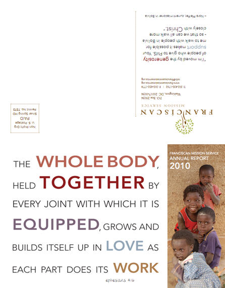
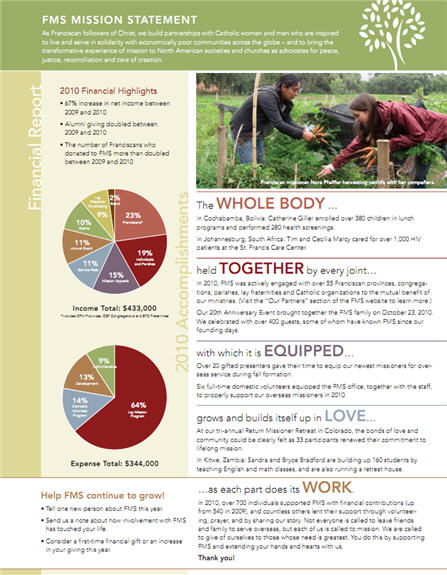
Franciscan Mission Service (FMS) recently published a two-page annual report. As you can see, it’s a self-mailer. I spoke with FMS executive director Kim Smolik about the decision-making process involved in producing something this short.
Kivi: What did previous FMS annual reports look like?
Kim: Last year’s was a 6-page spread. It was a lovely promotional tool. But I wanted to go even shorter this year. Prior to that, we had never done a professionally published annual report. We would just type up highlights and stats in a Word document and share it with a limited group. It wasn’t posted online.
What was hard about doing just two pages?
You really have to choose what you want to highlight. What was the greatest accomplishment of the year, and then how can we communicate that?
Because of the space constraints, we dropped the letter from the executive director or president, so it was harder to communicate in a personal voice.
I think it’s still really important to have the call to action, thank you, accomplishments and financials in there, so you just have to be selective.
How did you decide on the format and layout?
We had to find a format to add some punch to the accomplishments. Just listing out 8 bullets would be boring. We needed a theme for them, and for the graphics, to pull it together.
How did you decide on the Bible verse that you used as the theme?
We brainstormed on our biggest accomplishments, and then thought, “What’s the theme here?” We thought it was really about growing the organization, and connecting, and strong partnerships. So we Googled Bible verses that have those themes. We were really happy when we found the one we ended up using, because the accomplishments broke down into those five sections nicely.
In addition to the letter, what did you have to leave out?
We did have to cut back on the financials. You have to be very selective and focus on the main things that you want to highlight. We originally had more text around the pie charts but it was too crowded. It just wouldn’t fit, so we cut that back even further. But the pie charts communicate what we want to say well enough.
What about the list of donors? That’s a big concern for many nonprofits when considering a shorter format.
We’ve never done the big donor lists, so that wasn’t a problem. We have a lot of small-dollar donors, and what if someone’s name is spelled wrong? It just seems like a potential disaster.
What changes would you consider for next year?
In the future, I would choose to use the outside page for more quotes or testimonials, to bring in the voice and personal touch more.
What other advice do you have for others considering a two-page format?
My best advice is to brainstorm what you are proud about, what you did really well, and then try to find a theme to pull it together.
You’ll find the FMS Annual Report and more examples on the Nonprofit Annual Reports Wiki we are curating. We’ll also present our “New and Improved Nonprofit Annual Reports” webinar again in December. If you’d like to view a recording of that webinar, you can do so right now by purchasing an All-Access Pass.


