You should all know by now that I love the shorter and more visual nonprofit annual reports as opposed to skimming through 20+ pages of boring financials. I recently received an email from Katie Bryan, communications director at Iowa Citizens for Community Improvement on how their annual report has changed over the years based on the training she’s taken with us a Nonprofit Marketing Guide, along with a few of her thoughts on the changes. I thought you might like to see it too, so Katie agreed to let me share it with you.
Take it away Katie!
Hi there,
Thought I’d give you a little report back on our transition to a much shorter annual report.
2009 – This is pretty much how we had always done it. Some great quotes and headlines pop out, but then there are lots of words. It was a lot more “here’s all the stuff we’ve done” vs “here’s what we accomplished” — a switch we picked up from you.
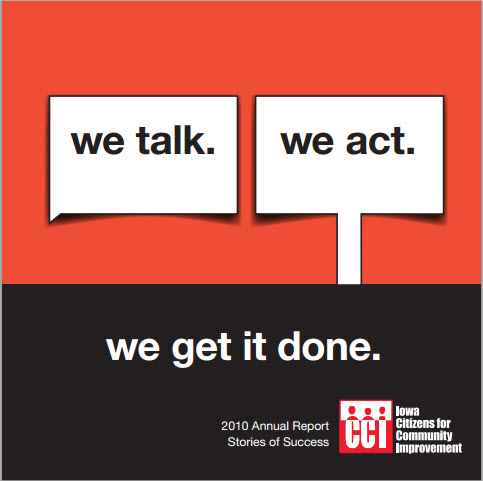
2010 – We made a big switch, but it was still pretty wordy. We tried to tell some stories and use member and organizer’s voices. We had high hopes of fewer pages, but in the end the text took up a lot more space than we thought. Still pretty wordy. But even if you didn’t read it, you could likely get a better sense of our work than in the 2009 version.
2011 – FOUR PAGES! And they’re small pages (8 x 8). We started out with the top accomplishments we had to share, then filled in images (had more but no room) and then worked the theme and letter around those. We had wanted to include more good member quotes but in the end were only able to fit in two.
2012 — Will the 2012 annual report be the year of the postcard?!?! I doubt it. 🙂
When I go back and read the 2010 report, I get a good sense of how we work with people and how our work makes people feel in addition to delivering some big accomplishments. But I love the efficiency of the delivery – and the efficiency of staff time it took to create the 2011 report. In the end, I think I’d like to end up somewhere between 2010 and 2011’s end product.
Always a learning curve.
Thanks a lot!
Katie B
Katie, I really like both your 2010 and 2011 reports, so a happy medium sounds good to me. Both are vast improvements over the 2009 approach, which we still see so many nonprofits doing unfortunately!
For more on annual reports and how you can create an annual report that people will actually read see our Annual Report Resource Page.

![12 Things You Can Stop Doing Right Now [Infographic]](https://www.nonprofitmarketingguide.com/wp-content/uploads/2025/01/Stop-Doing-2025-Info-hung-up-500x383.png)


