Here’s yet another great example of how remaking your tired old traditional annual report into something more modern can reap great rewards . . .
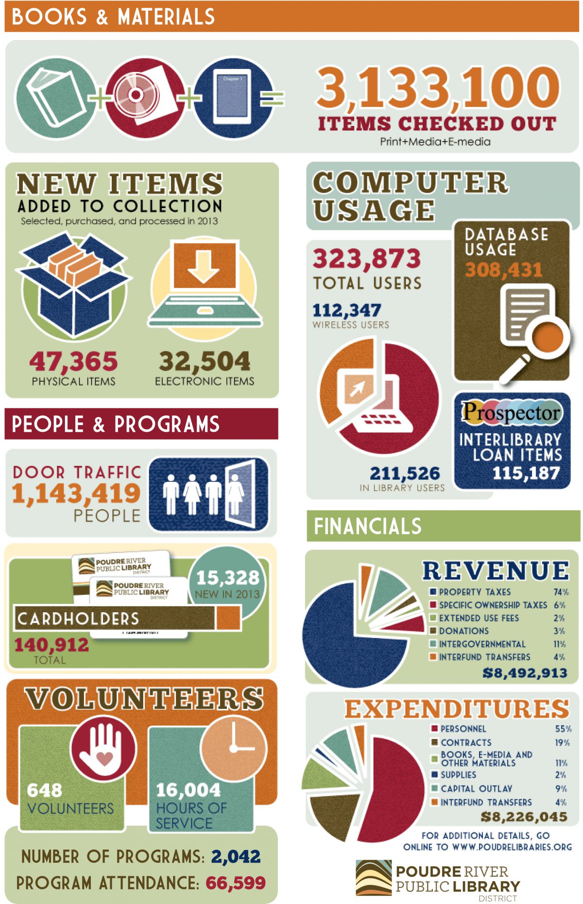
Paula Watson-Lakamp, Communications Manager at Poudre River Public Library District, shared how they pared down their 32-page (!!) annual report into an infographic that created more member engagement, especially on social media.
They were able to go from 32 pages to this:
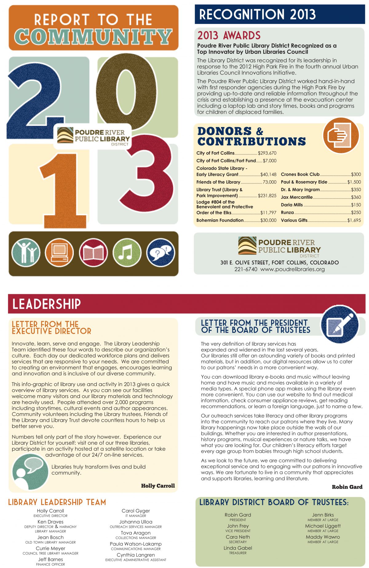
Then, as Paula explains:
We separated out the infographics that would be most interesting and used them as a type of “contest “ on our Facebook page – for example, we would ask, “Guess how many people came through the library doors in 2013? (Answer will be up tomorrow).”
The social media engagement worked! We had some great guesses, really boosting the Facebook engagement. Then the next day we put up the infographic with a link to the full annual report.“
Here are some of the smaller pieces they pulled from the larger infographic:
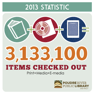
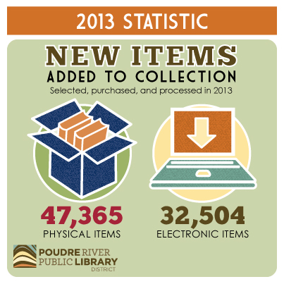
Paula said customers as well as staff loved the different format, and she has even seen the report posted in a couple of staff cubicles.
How can you revamp and repurpose your annual report? Share with us what you’ve done!
For more, see Nonprofit Annual Report Best Practices, Example, and Templates.

![12 Things You Can Stop Doing Right Now [Infographic]](https://www.nonprofitmarketingguide.com/wp-content/uploads/2025/01/Stop-Doing-2025-Info-hung-up-500x383.png)
