I’ve never liked fundraising thermometers.
For me, unless you are fundraising to increase global warming or to pay for a new heating system in your building, temperature rising in a thermometer really doesn’t make much sense as a visual for achieving fundraising goals. Sure, most people understand what you are saying, because fundraising thermometers have become so cliché, but I don’t think that’s a good enough reason to stick with bad artwork.
How you visually convey your goals should be a compelling part of your campaign!
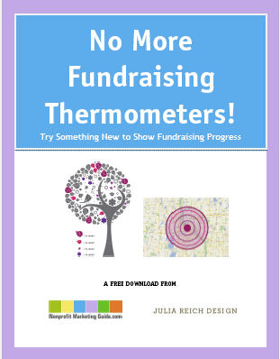
This summer, I posted a question from Luke Reynebeau, a student board member and program coordinator for the University of Minnesota YMCA, about alternatives for fundraising thermometers. I was so impressed with the creativity in all of your comments that I enlisted the help of Julia Reich Design to illustrate several of the ideas.
We’ve turned them into a free download to help you think more creatively about ways to show fundraising progress. It may be too late for this year’s annual campaign, but I encourage you to take a hard look at your goals, to get inspired by the e-book, and to think about changes you can make in 2012.
I also hope that the various providers of online fundraising pages will jump on this and start offering alternatives to thermometers too!
Download “No More Fundraising Thermometers!” Now


