On Monday, I asked if you could boil down your annual report to just six words. We are getting some great examples: check them out in the post comments!
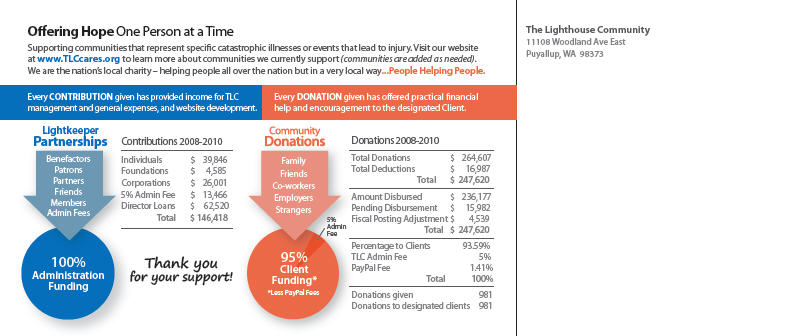
But of course, I realize six words is probably not enough for most of you. What about a postcard? That’s more room, but still very short and readable, and one of the formats I advocate as the New and Improved Nonprofit Annual Report. It’s a scaled-down version that can still work in print, or online, and that makes more sense for both you as the nonprofit marketer and fundraiser and for your supporters (it’s actually one of a handful of different formats that work for 2011).
After I presented this webinar in February, Elissa Schloesser at Visual Voice created a mockup of what a postcard annual report might look like.
And now she has produced a real one for a client:
I’m hosting the latest version of one of our most popular webinars, The New and Improved Nonprofit Annual Report, on Thursday, June 24, 2011. Join us to learn how you can transform your annual report into something people will actually pay attention to.
Today’s Book Giveaway
Could a postcard annual report work for your organization? Why or why not?
Leave a comment below answering (especially the why or why not part), and you’ll be entered to win a free copy of “#SocialMedia Nonprofit Tweet: 140 Bite-Sized Ideas for Nonprofit Social Media Engagement” by Janet Fouts with Beth Kanter. We’ll draw the winner next week, so you have plenty of time to add your ideas.
I’m giving away a book each day this week, in celebration of the one year anniversary of my own book’s release, The Nonprofit Marketing Guide: High-Impact, Low-Cost Ways to Build Support for Your Good Cause(on sale for $23.29 at Amazon).


