I know many of you are working on your 2017 budgets now, so rather than make you wait until mid-January to get the budget information from our 2017 Nonprofit Communications Trends Report, I’m sharing it with you today.
I hope you can use this data to make the case for increasing your budget!
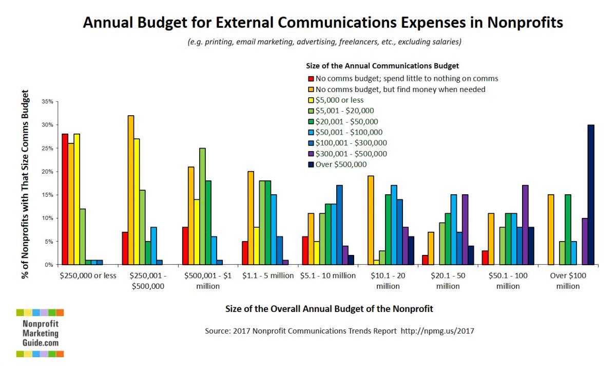
Here’s how to read this graph: Find your nonprofit’s overall budget size along the bottom. Then look at the colored bars above it, and you’ll see the distribution of the various communications budget sizes.
For example, if your nonprofit is in the $5.1 – $10 million range overall, you can see that 17% of nonprofits at that size have communications budgets of $100,000 – $300,000 (the royal blue line).

To see the larger trends, notice how you see much more red, orange, and yellow to the left, which means no budget or a very small one. In the middle of the chart, around the $500,000 – $5 million ranges, we see more green, which equals communications budgets in the $5,000 – $50,000 range. The blues dominate at the $5 million – $20 million range, which equals communications budgets of $50,000 – $300,000.
Obviously, these are still big ranges, but at least we know where the ball park is now! This is the first data of this kind that I am aware of. If you have other data sources on communications budget size, please share in the comments so we can compare.
Of course, we will share much more detail in the full report in January, but I can tell you that there were very few significant differences based on mission or on the area of the country — overall budget size was the most significant indicator of communications budget size in our survey.
Stay tuned for more!

![12 Things You Can Stop Doing Right Now [Infographic]](https://www.nonprofitmarketingguide.com/wp-content/uploads/2025/01/Stop-Doing-2025-Info-hung-up-500x383.png)


