If you want website visitors to sign up for your email newsletter, you have to make it easy and give them a compelling reason to do so.
Let’s look at a few ways to do more than just say “sign up for the newsletter.”
Be More Specific About What They’ll Get
The easiest approach is to simply be more specific about what you are sending out in your newsletter.
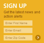
Here’s the signup box from the Humane Society of the United States, promising the latest news and action alerts:
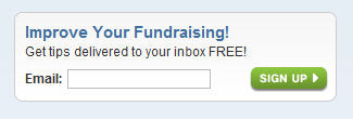
Here’s one from Network for Good, offering free tips with a clear benefit (improving your fundraising):
Let Them See a Sample
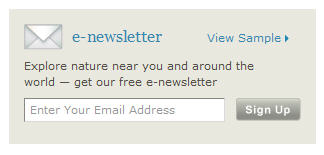
The Nature Conservancy’s sign-up box includes a “View Sample” link that takes you to the latest edition, so you can see what you are really signing up for.
Every Now and Then, Hijack the Home Page
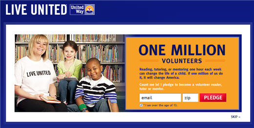
While I don’t recommend you do this all the time, for specific campaigns, you can hijack your home page with an email list sign-up. Here’s one that United Way is doing right now, centered on a pledge to volunteer. This is what you see on the home page . . . clicking Skip at the bottom takes you to the regular home page.
When you take this approach, your initial emails to the people who sign up should be focused on the pledge or campaign specifically, but then you can transition them to your regular e-newsletter. This same tactic is also used with online fundraising, particularly at the end of the year.
Want More Tips?
On Tuesday, August 23, 2011, I’m teaching a webinar called Building Your Lists of Email Subscribers, Friends, and Followers where I’ll share tips from nonprofits (as well as my own experience) on how to build your lists of e-newsletter readers, blog subscribers, and social media fans/followers.
What Does Your Sign-Up Box Look Like?
Nonprofits, tell us about your email sign-up box and how it’s working for you in the comments — and include a link to your website!
