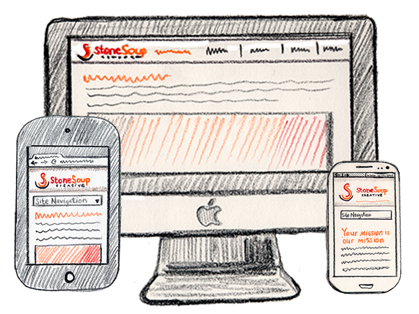
 In this post, one of our favorite graphic designers, Julia Reich, toots the horn for responsive design, explaining why she decided on responsive design for the new Stone Soup Creative website; why she and her team will endeavor to build it into sites they’ll be designing for their clients from here on in; and why she recommends you consider it for your site too.
Guest Post by Julia Reich of Stone Soup Creative
As you know from reading Kris’s post on the subject, responsive design is an approach to website design in which the site is engineered so the design and functionality is tailored to the capability of the visitor’s device – most importantly, screen size. So no matter what computerized gadget you use, the page fills the space on your screen and your website visit ends happily ever after.
Users interact with small devices in a fundamentally different way than with a laptop or desktop – the main control device changes from a mouse with corresponding arrow or hand icon to a fingertip. A finger is larger and obviously not nearly as accurate as a mouse, and it can’t trigger the same “hover over” action that partially defines the online desktop user experience. Instead, it’s a direct touch-screen interface, usually designed with large, fingertip-friendly buttons.
When I created the new Stone Soup Creative website, I knew from studying Google Analytics that a significant segment of my site’s traffic was originating from handheld devices. I wanted to meet the growing expectations of these mobile users, so that visitors with any device, and any screen size would be successful – not exasperated – when viewing the site.
Definitions
Since the distinctions can be subtle and confusing, here’s a glossary of strategies for viewing websites on different screen sizes
Mobile-friendly
A mobile-friendly website is an HTML-based website that is viewable on a smartphone. These sites never contain Flash, since Flash can’t be seen on mobile devices. Although they should be easy to use, the truth is they aren’t always.
Tim Halbach is Stone Soup Creative’s Technical Director. He points out that “if a site starts so that you have to scroll horizontally, or you have to zoom out to see it, then I wouldn’t consider it to be mobile-friendly at all.”
Mobile-optimized
A mobile-optimized website is separate from a “regular” site you’d view on a “regular” desktop computer. No scrolling or pinching or zooming is necessary, as the navigation has been structured specifically for smaller handheld displays with touch-screen interfaces. Pro: Images load quickly, and content is kept to a minimum. Con: Don’t mobile users want access to all of the information and functionality available to desktop users?
Halbach agrees: “The key problem is that ‘separate site’ is usually synonymous with ‘incomplete functionality’ – which is why I always find myself clicking on the ‘Go to Full Site’ link. Not a good user experience.”
Responsive design
This is a site that is engineered to re-format itself according to the screen size of a visitor’s device. This is the strategy I’m discussing here since, as an emerging technology, it holds the most promise for successful usability.
App
Apps don’t technically belong in this category, as they are applications that are downloaded and installed on your mobile device, rather than being called up from within a browser. A separate app needs to be developed for each iPhone, Droid, etc. device. An app usually has a very specific purpose – such as an interactive game. Think of it more as a small computer program than a website. Users commonly download apps via Apple’s ITunes and Android’s Play Store.
Keep in mind that strategies for viewing websites on different screen sizes can fall along a spectrum. For example, “mobile-optimized sites are not always separate sites, as they can be done as ‘partially-responsive’ design… meaning, rather than lots of design breakpoints for different browser sizes, it just has two – standard and mobile. That’s actually considered a best practice in today’s design world, if you’re not going full-blown responsive,” notes Halbach.
Examples of Organizations with Responsive Design Websites
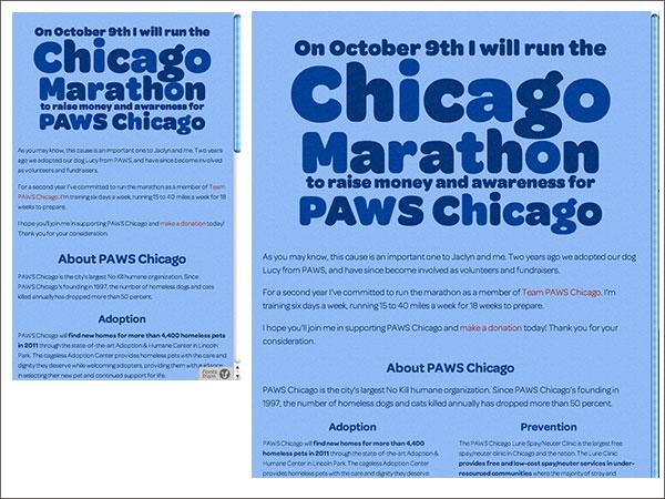
An attractive, easy-to-read, type-only design.

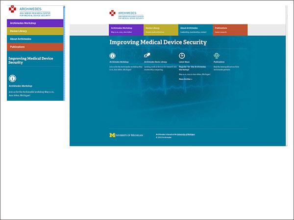
Archimedes: Ann Arbor Research Center for Medical Device Security
A fluid grid system ensures navigation and columns stack neatly as the screen gets progressively more narrow.

Jewish Social Justice Roundtable
The team at devcollaborative created this site in Drupal by customizing a theme that had a pre-built responsive grid. Using a ready-made responsive grid means that there are some design limitations, but that the decisions about how the content “responds” on narrower screen widths are already made. This lowers the cost of a responsive web design considerably.

Planning for the Responsive Design Website
Compared with a “regular” website, a responsive design site is oftentimes more costly to create.
Because responsive design allows you to build and maintain one site that adapts automatically for all browser sizes and displays, it requires the site’s design and development team to think about the breakpoints – the point at which your site’s content will respond to provide the user with the best possible layout to consume the information.
“This often requires more planning around information architecture,” says Erin Fogel of devcollaborative.com, a web development team that builds Drupal websites for nonprofits (including the Jewish Social Justice Roundtable example mentioned above).
Keep in mind that it also takes more time to build responsive design into an existing site than it does to integrate it into a new site as part of the original site structure. Fortunately there are many popular themes available for Drupal and especially WordPress platforms (which was my choice for Stone Soup Creative) – themes which are already styled and ready to be implemented out of the box.
Fogel’s advice for NPOs embarking on a site re-design that’s responsive? “Simplicity! Clean-looking, organized sites are not only trends in design, but will also make the build easier and more affordable.”

Julia Reich
Resources
For readers interested in learning more about responsive design:
- Create A Responsive, Mobile-First WordPress Theme
- 7 Responsive Design Tips to Revamp Your Workflow
- Separate Mobile Website Vs. Responsive Website
Julia Reich is the Principal at Stone Soup Creative. You can reach her:
Twitter: @juliareich
Facebook:www.facebook.com/StoneSoupCreative
LinkedIn: /www.linkedin.com/in/stonesoupcreative
For over 12 years, Julia has been helping nonprofit clients bring to life innovative branding, design & marketing projects at Stone Soup Creative (formerly Julia Reich Design). She blogs on her own site and guest blogs for NTEN, Nonprofit Marketing Guide, and Marketing Mentor.


