

We recently presented a new webinar on modern nonprofit email newsletter designs. If you missed it, All-Access Pass holders can watch the recording in our private community.
We looked at more than a decade of nonprofit email newsletter designs and compared those to best practices today, which was very eye-opening for many participants. Are you still emailing like it’s 2020, 2017, or even 2012?
Here are seven pointers we recommend for any nonprofit considering a newsletter redesign. Based on the number of webinar participants who said they wanted to implement this change, I’m sharing these in order of importance. Eighty-four nonprofit communicators participated in the polling for reference. Keep in mind they wouldn’t have voted for it if they had already made the change.
1. Shorten, Shorten, Shorten.
Nonprofit email newsletters are almost universally too long. Shorten, shorten, shorten. If you have that much great info to share via email, consider sending your newsletter more often instead of cramming everything in. This was the most popular change participants wanted to make, with 65% saying they would like to shorten their nonprofit’s email newsletter.
More: Three Trends That Beg for Shorter Email Newsletters
2. No Paragraphs Longer Than Three Sentences.
One easy way to shorten your newsletter is to stop with the big blocks of text! Shorten your sentences and paragraphs! Keeping your nonprofit email newsletter design short also means making it skimmable, which means shorter blocks of text. A little over half of participants, 54%, said they wanted to try this.
3. Simplify the Header.
Don’t blow the most important email real estate right at the top with a meaningless graphic. Your “from” line should tell them it’s from you, and you don’t need to name your newsletter with an enormous graphic. Keep it small. Forty percent of webinar poll takers wanted to simplify their headers.
4. Add Motion to the Top.
Everywhere you look online, we know video works. But how do you capitalize on that with email? Adding animated gifs to your newsletter can work, whether you use three seconds from a video you link to or a more traditional animated gif you create in something like Canva. Forty percent of webinar poll takers also wanted to add motion to the top of their email newsletters.
5. Use One Main Article Followed by Secondary Teasers.
Here’s another way to keep your newsletters shorter and skimmable: Prioritize the content for your readers. Give more space to the single most important message and follow that with something more akin to bullets or teaser copy. About a third, 36%, wanted to try this approach to their nonprofit email newsletter design.
6. Left Justify Everything.
There’s no need to get fancy. When folks are skimming emails, it’s too much work for their eyes to dart around left, right, and center, trying to figure out what they should be looking at. Left-justify everything so it’s easy to skim. About a quarter, 26%, thought this could be helpful with their email newsletter redesign.
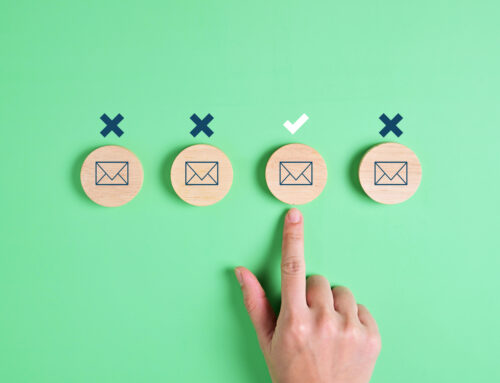
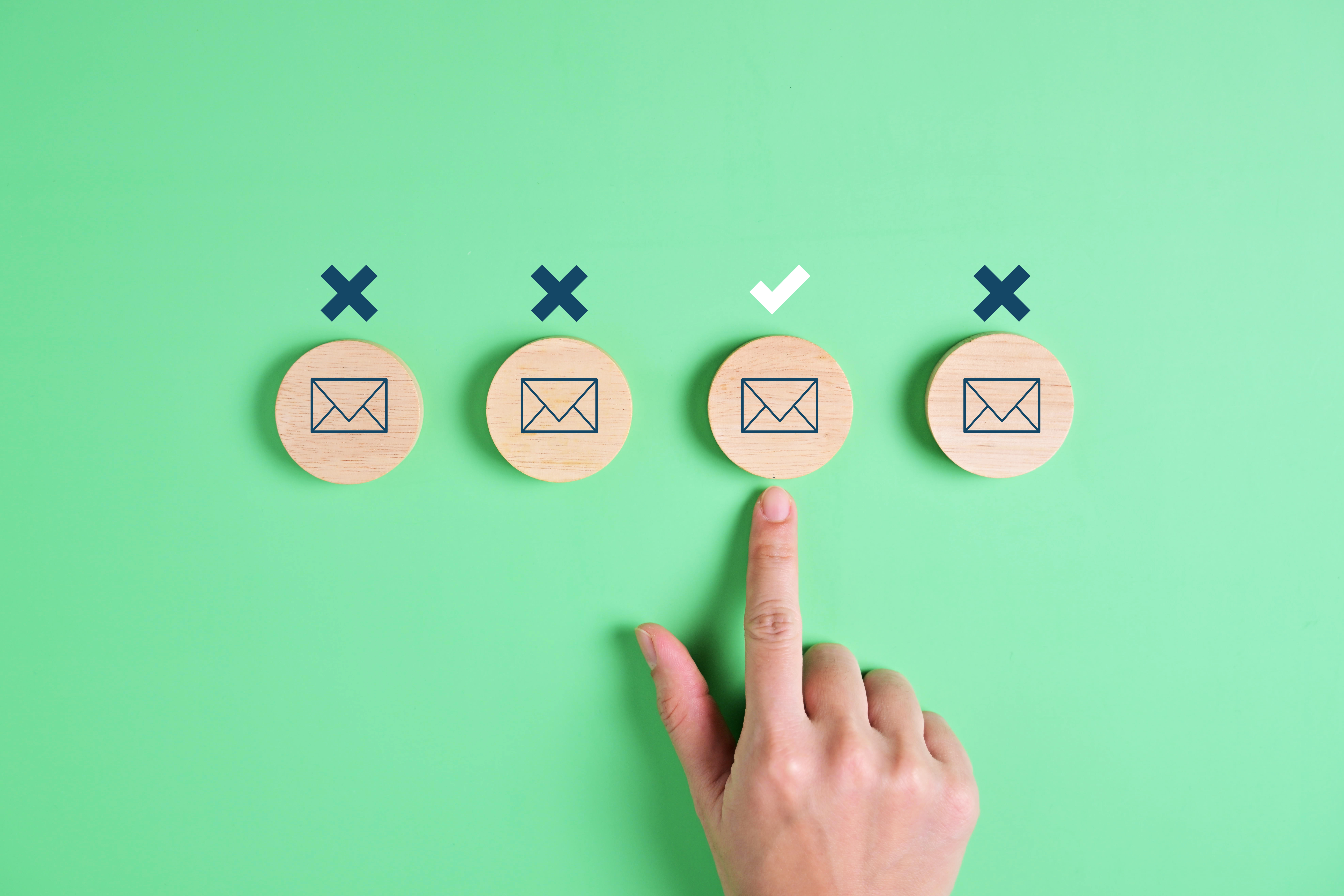
7. Limit the Use of Extraneous Lines and Photos That Don’t Add Meaning.
If it doesn’t add meaning, get rid of it. We reviewed many nonprofit newsletters with extraneous lines and photos that didn’t add any meaning but were just filler. A well-placed icon can often convey more meaning than a vague photo! A fifth, or 20%, of participants wanted to consider this tip when redesigning their nonprofit email newsletter.
See our Nonprofit Email Newsletter Best Practices and Tips for more.

