Have you noticed this on the top of your desktop Facebook?

We’ve known that another major Facebook redesign — called FB5 because it’s the fifth major redesign — was in the works for a while now. But what a wonderful time to fully roll it out! (I know you hear all the intended sarcasm in my voice.)
I guess it makes sense to Facebook to roll this out now because, guess what, we are all using Facebook even more than before since many of us are stuck at home.
For the time being, you can toggle back and forth between “The New Facebook” and “Classic Facebook.” In clicking around, I found a page or two that looked especially janky with this warning:

But, dang, do nonprofit communications directors need One. More. Change. to manage? As if the mental load we are all bearing isn’t heavy enough. FFS, Facebook!
OK, enough crabbing. Let’s look at a few changes (and, honestly, there will probably be more crabbing.)
Facebook wanted to streamline the desktop version in much the same ways that it has the mobile apps. I appreciate streamlining in theory, but we all know that’s just a euphemism for “we are moving your things and you may or may not be able to find them again.” I am still pissy about Facebook removing lists. (See, I could NOT make it through one paragraph without the crabbing. I blame Rona.)
Onward . . . Here are the changes to basic posting:
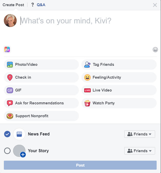
And now it looks like this:
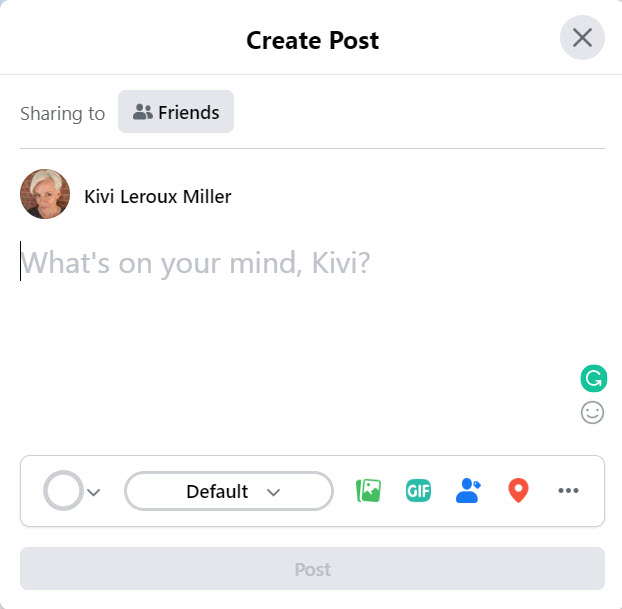
What’s under Default, you ask?
Why, fonts, of course! And the white circle is where you find your color options. It’s much more Story-esque.
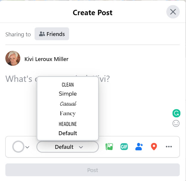
So, I do like that “Sharing To” is much more prominent. That’s part of Facebook’s stated desire to give us more control over who sees what. It’s great for people who switch between Friends and Public often.
The News Feed is still there but highlights Groups and Events more (two features we emphasize in our webinars, Social Media Strategies That Won’t Waste Your Time.) Groups has its own prominent feed now (under the icon with the three people), and some suggest that this may eventually become the main News Feed.
What about those all-important Pages and Groups you manage?
Here’s what the top of Pages looks like under Classic Facebook and New Facebook:
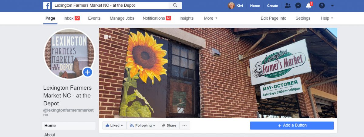
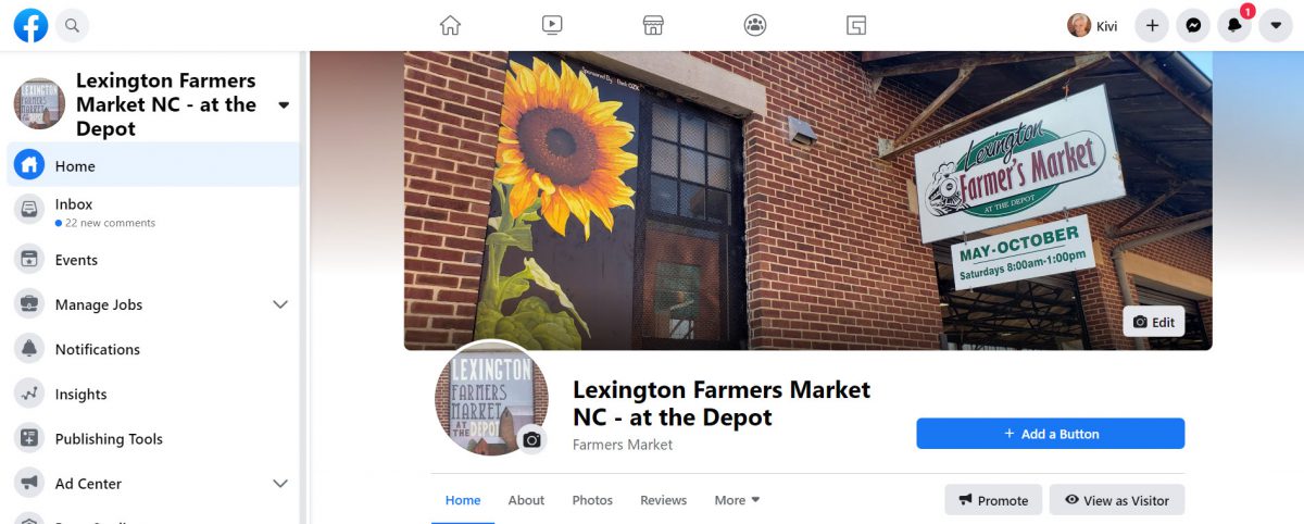
Top of a Page on New Facebook
Here’s what the top of Groups looks like under Classic Facebook and New Facebook:
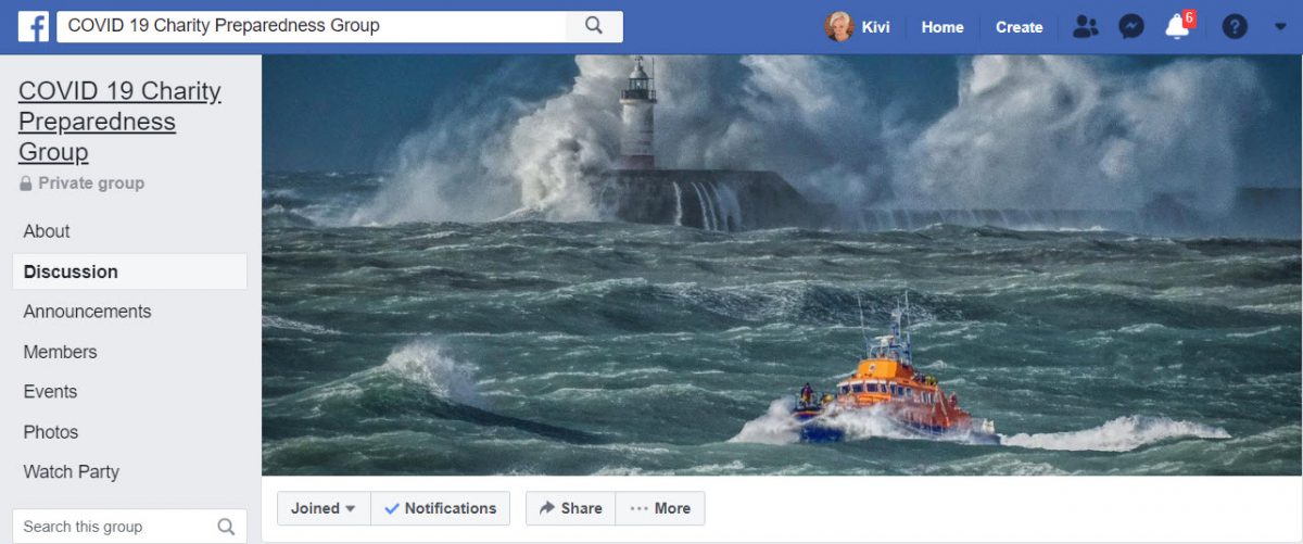
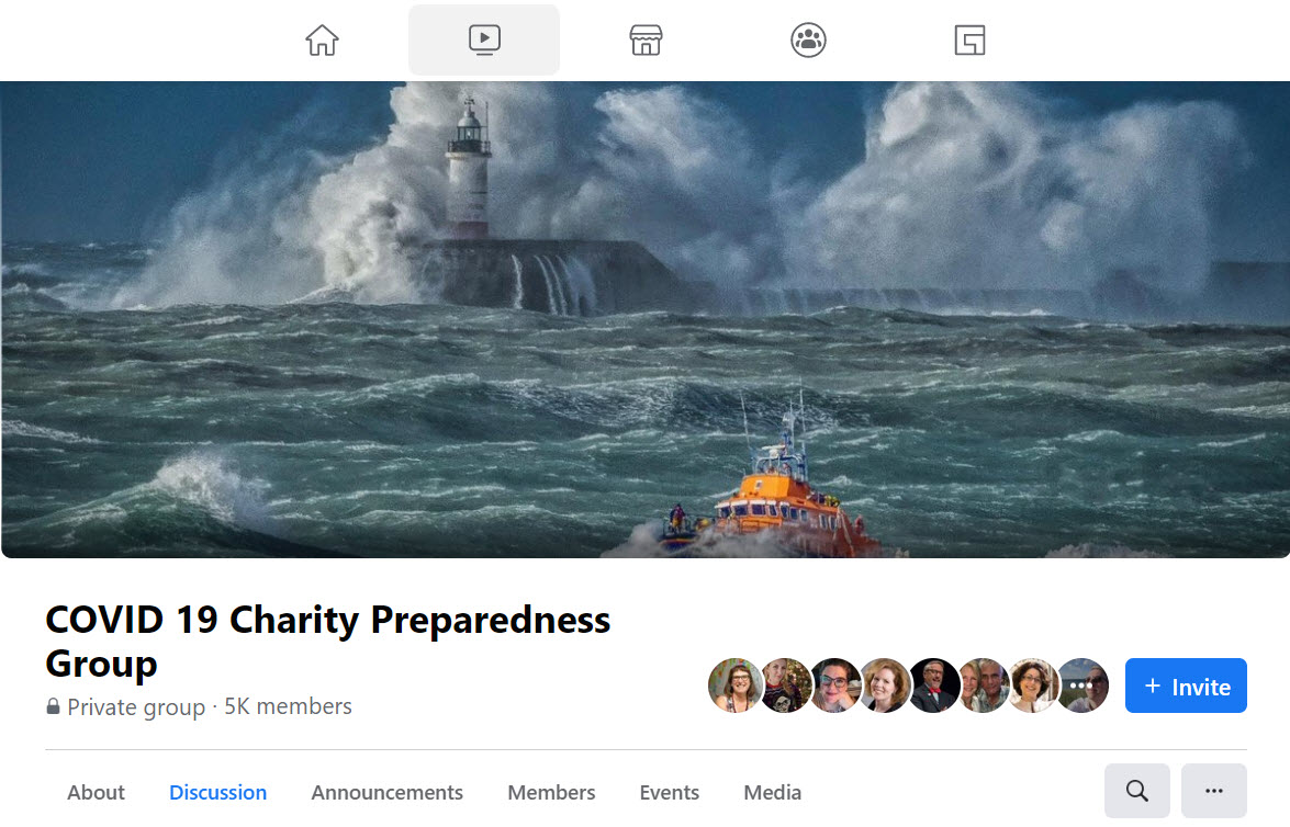
I know your big question: Have the photo sizes changed again?!? Yes, it seems so, although the differences aren’t huge. You can compare the cropping above. As long as you keep the important stuff in the center, you should be OK.
What else? Users can also select dark mode.
I am sure Facebook has eliminated something I love in this version, but I haven’t figured out what that is yet. They tend to quietly eliminate things during redesigns, especially one as big as this.
Perhaps they have added something I will love. I do like the Groups Feed and the Watch icons right at the top. But the new Gaming section (those two interlocked blocks)? Nope.
Let us know what you discover in the New Facebook, good and bad! It will probably take several weeks of all of us using it to figure out all the changes.


