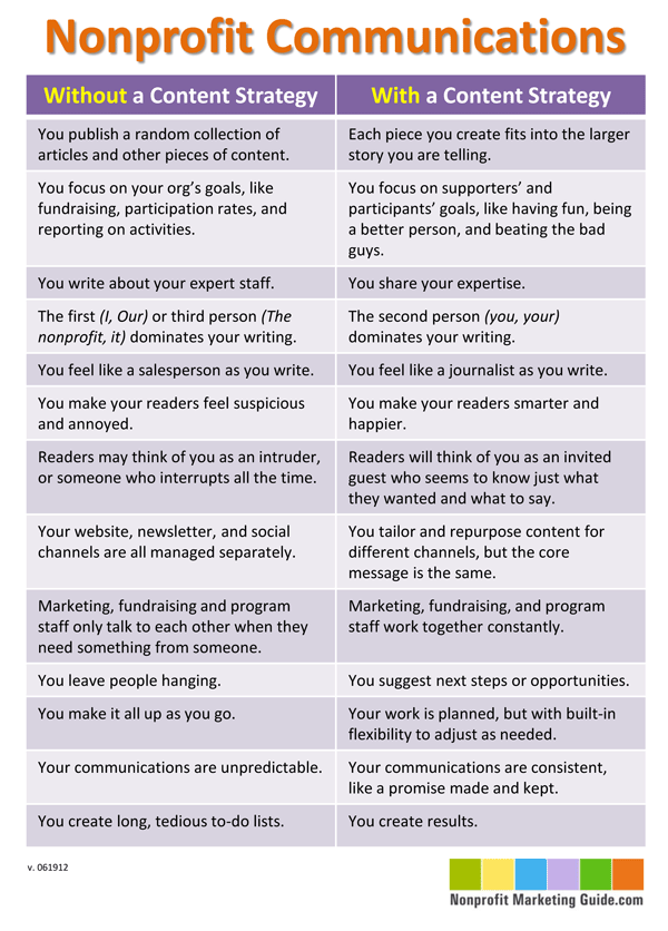
I’ve been working on ways to explain how a nonprofit’s content marketing strategy is different from all the same old nonprofit communications you may have been publishing all along. So I made this chart yesterday. I posted it to Facebook last night and based on the positive reaction there, I hope you’ll like it too. I also shared it in my weekly e-newsletter this morning.
What do you think? Does this resonate with you?
This is just the first edition, so help me improve it by leaving your comments on this post.


