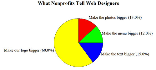
Yes, it’s more fun with graphs, thanks to Katya.
If this made you laugh, you can return a little joy by giving $10 to my fundraiser to fight HIV in the South (Thank you!)
If it didn’t, let’s look at the serious point behind this graph . . . Your website design should focus on your visitors. Making your logo bigger is usually not the best way to improve your visitor experience. Seen any websites with logos that are waaaay too big? Share by leaving a comment.


